01
Introduce KPI View Tools
The KPI View page provides a variety of tools for trends and analysis.
In this tutorial, you will learn how to use the KPI View tools in Reflect to adjust time ranges, change chart types, apply filters, manage chart settings, and analyze KPI data effectively.
Go to ReflectThe KPI View page includes several tools for data exploration and visualization. You can select a time range, refresh KPI data, switch between chart and table views, change chart types, download Excel files, apply filters, and customize chart display options.
The KPI View page provides a variety of tools for trends and analysis.

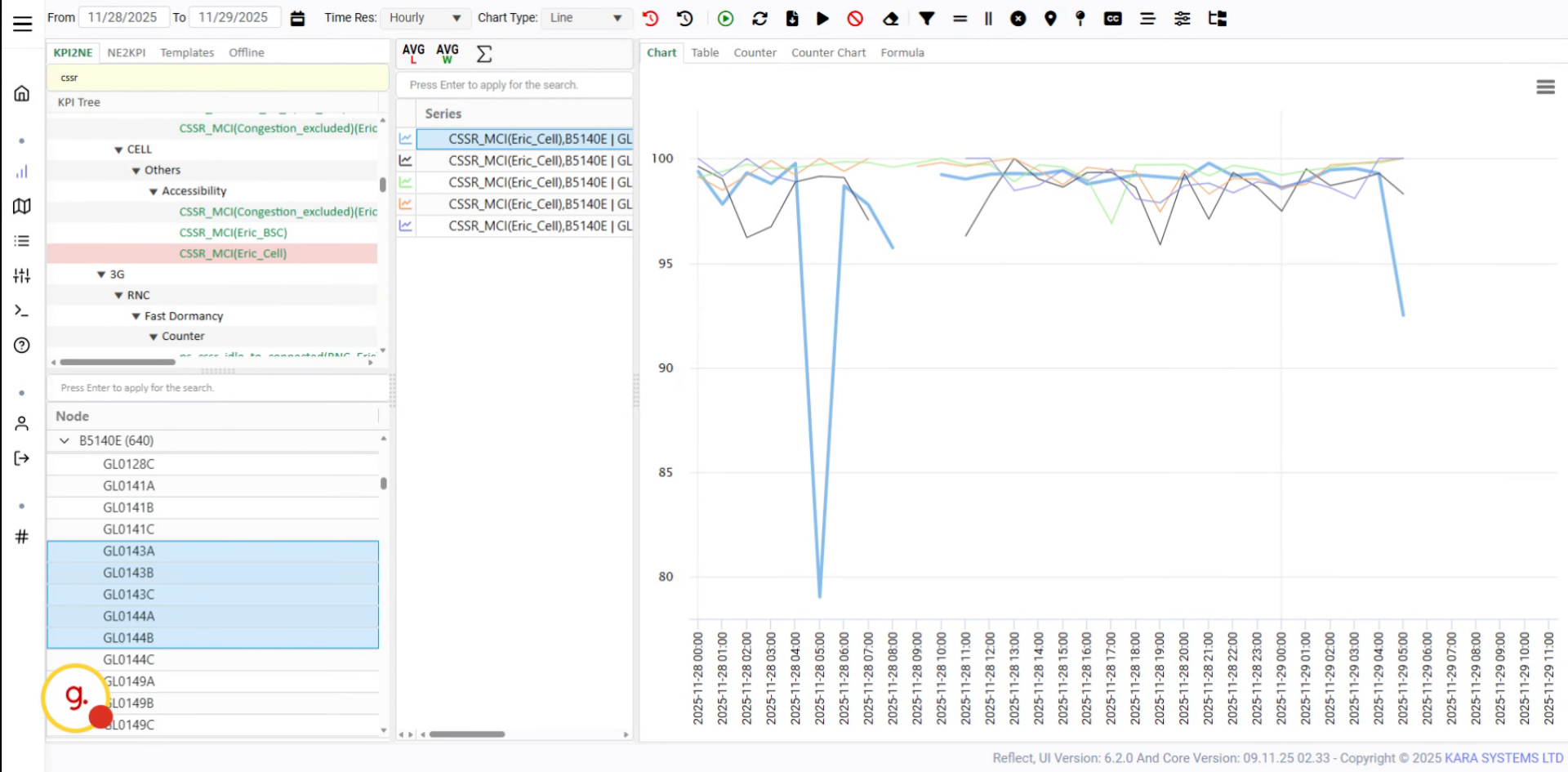
Click the time range button to select the desired period for the selected KPI.
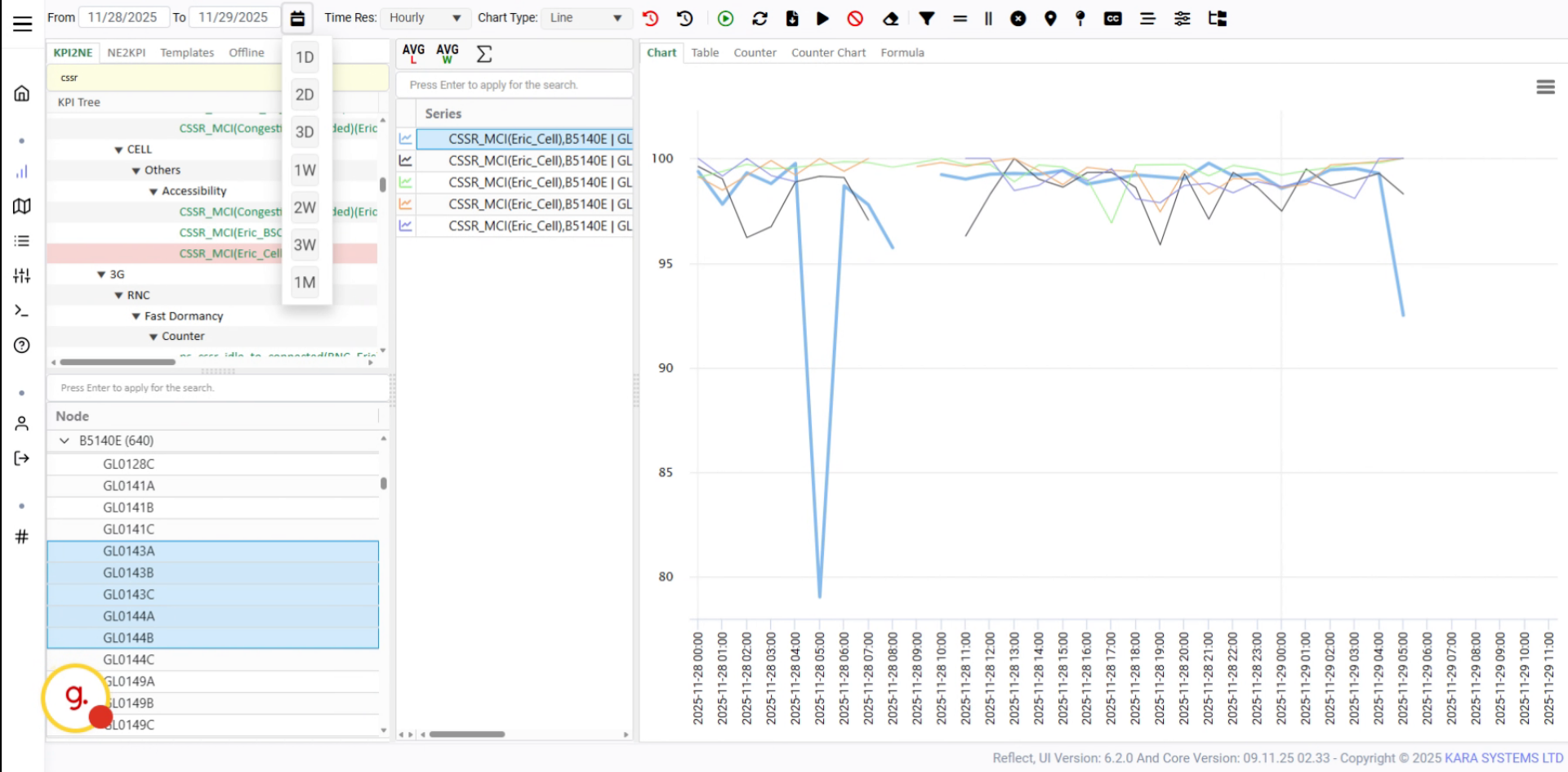
You can also choose a custom date range using the calendar tool.
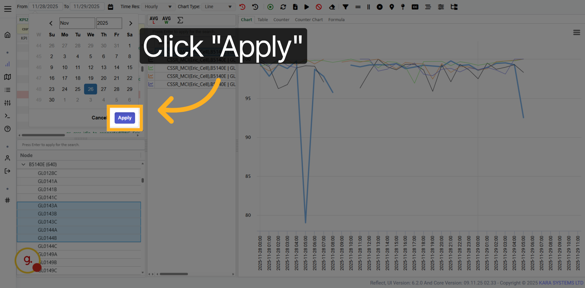
Click the Apply button to confirm your selected date range.
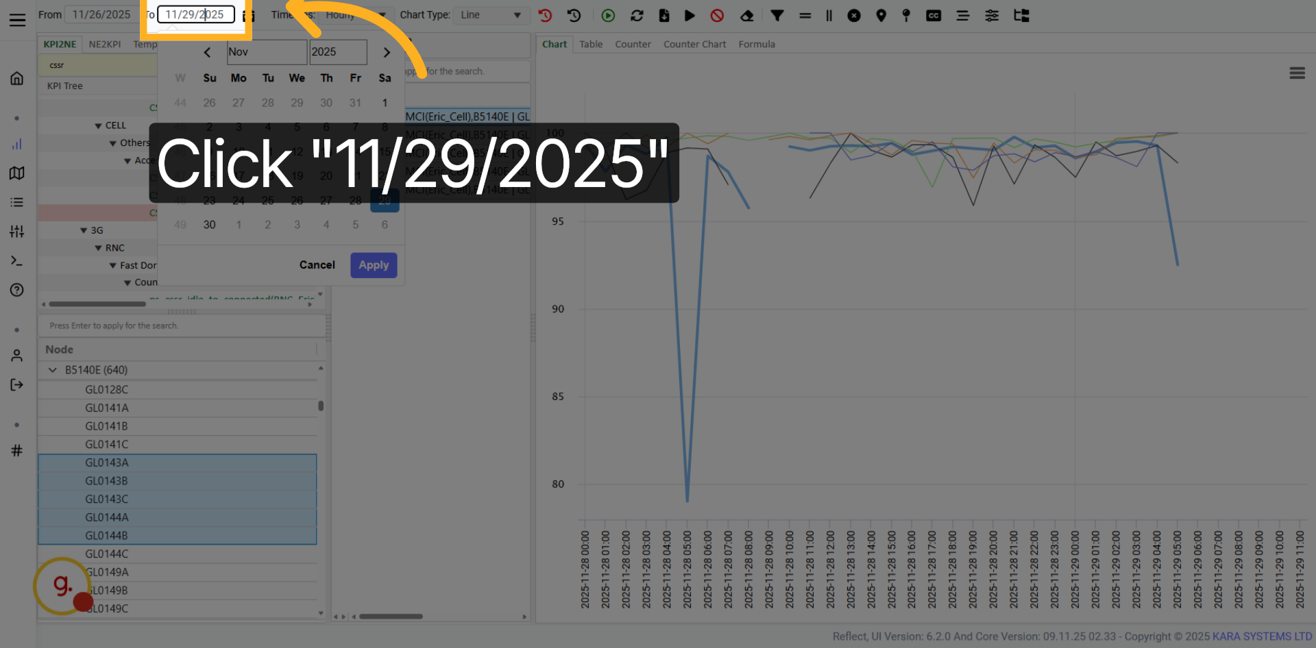
Open the date picker to select the start date for your KPI data range.
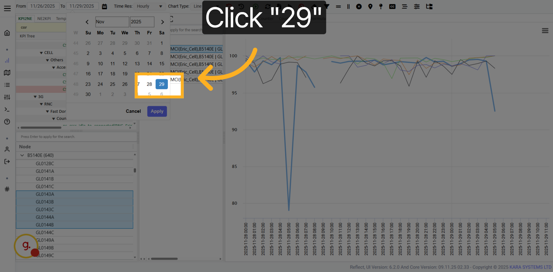
Choose a specific day from the calendar to set it as your start date.
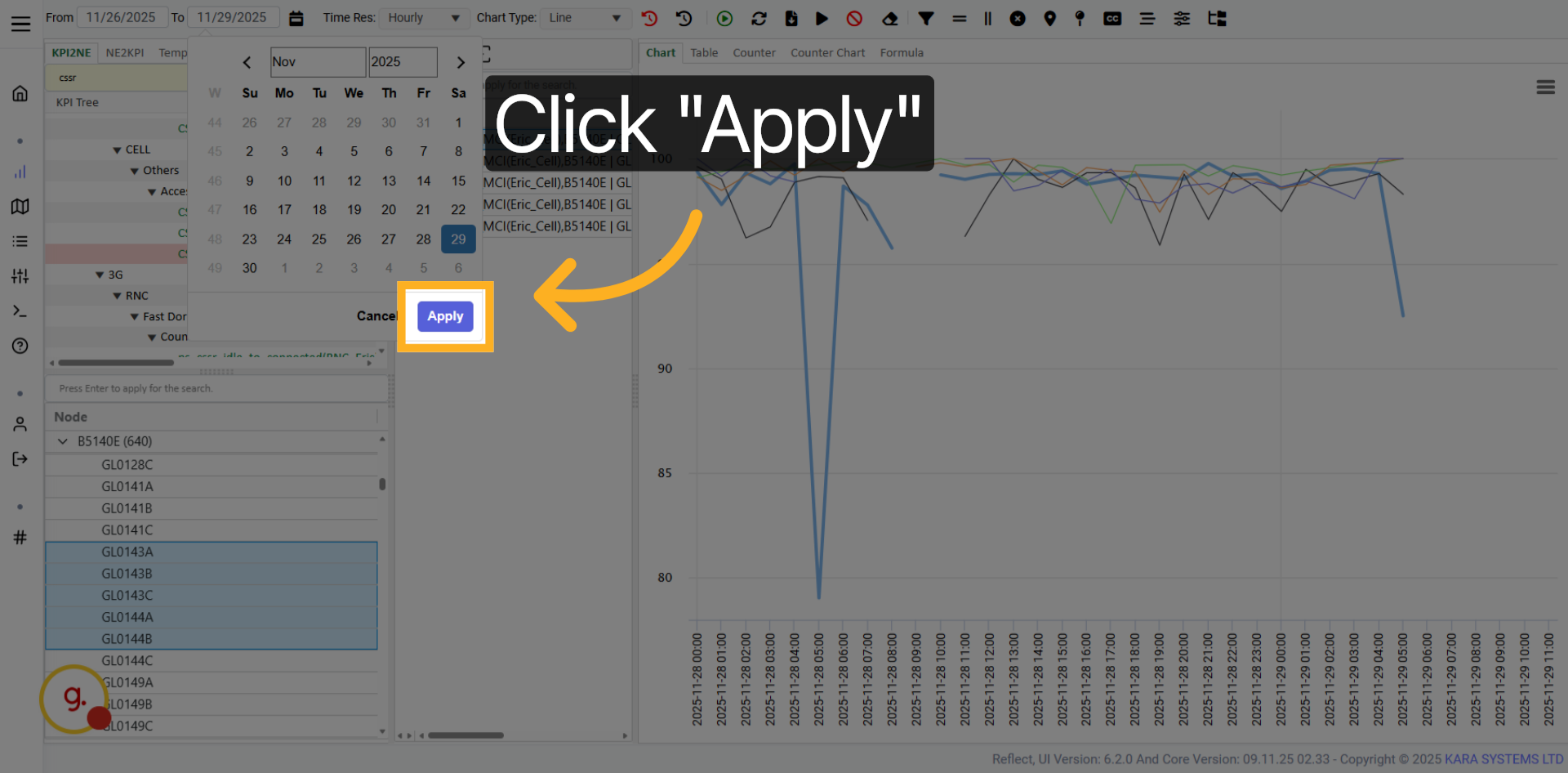
Click Apply to finalize the date selection.

After selecting a new date range, refresh or reload the KPI data.
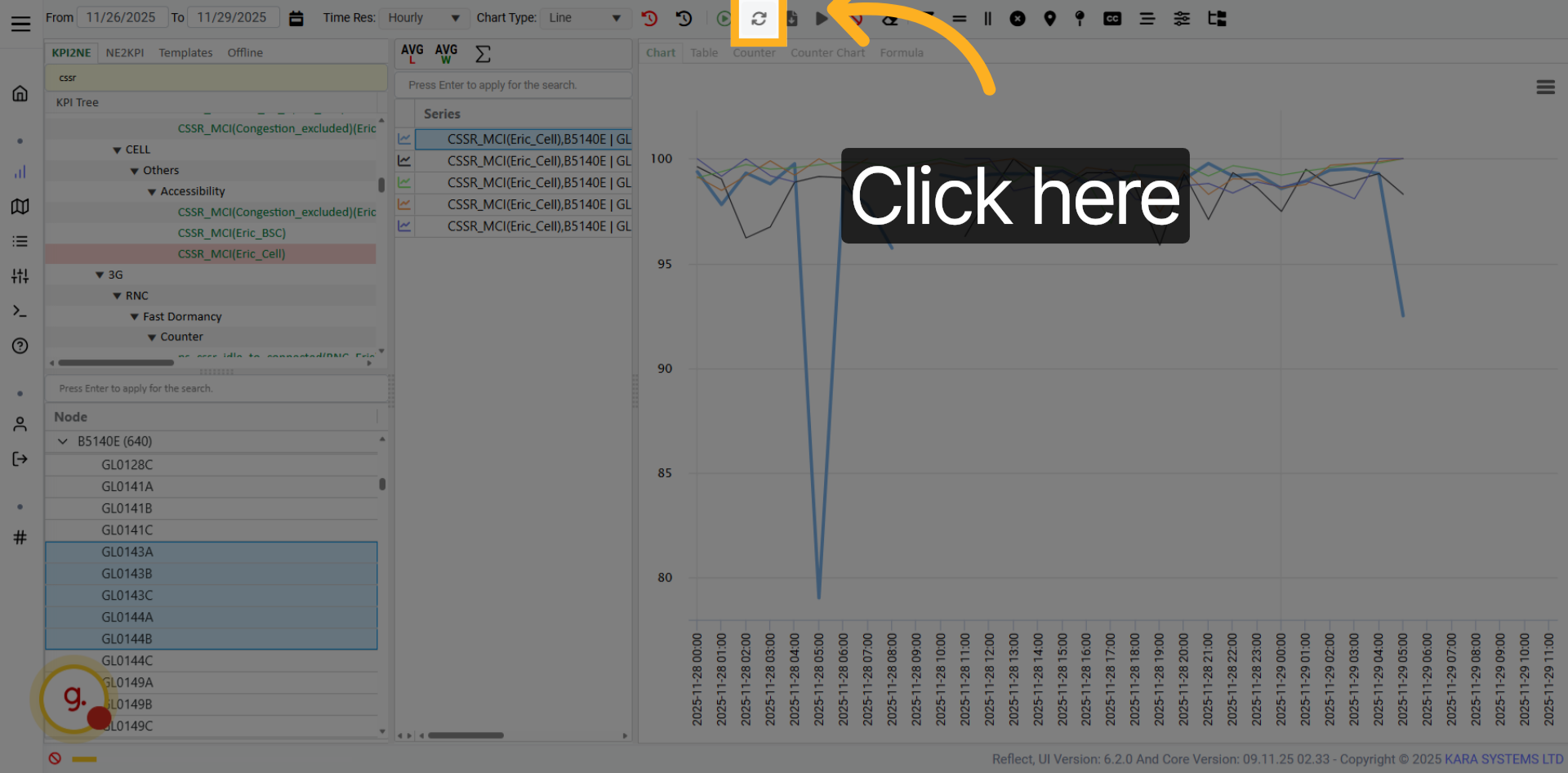
Click the refresh button to update the KPI data and reload the view.
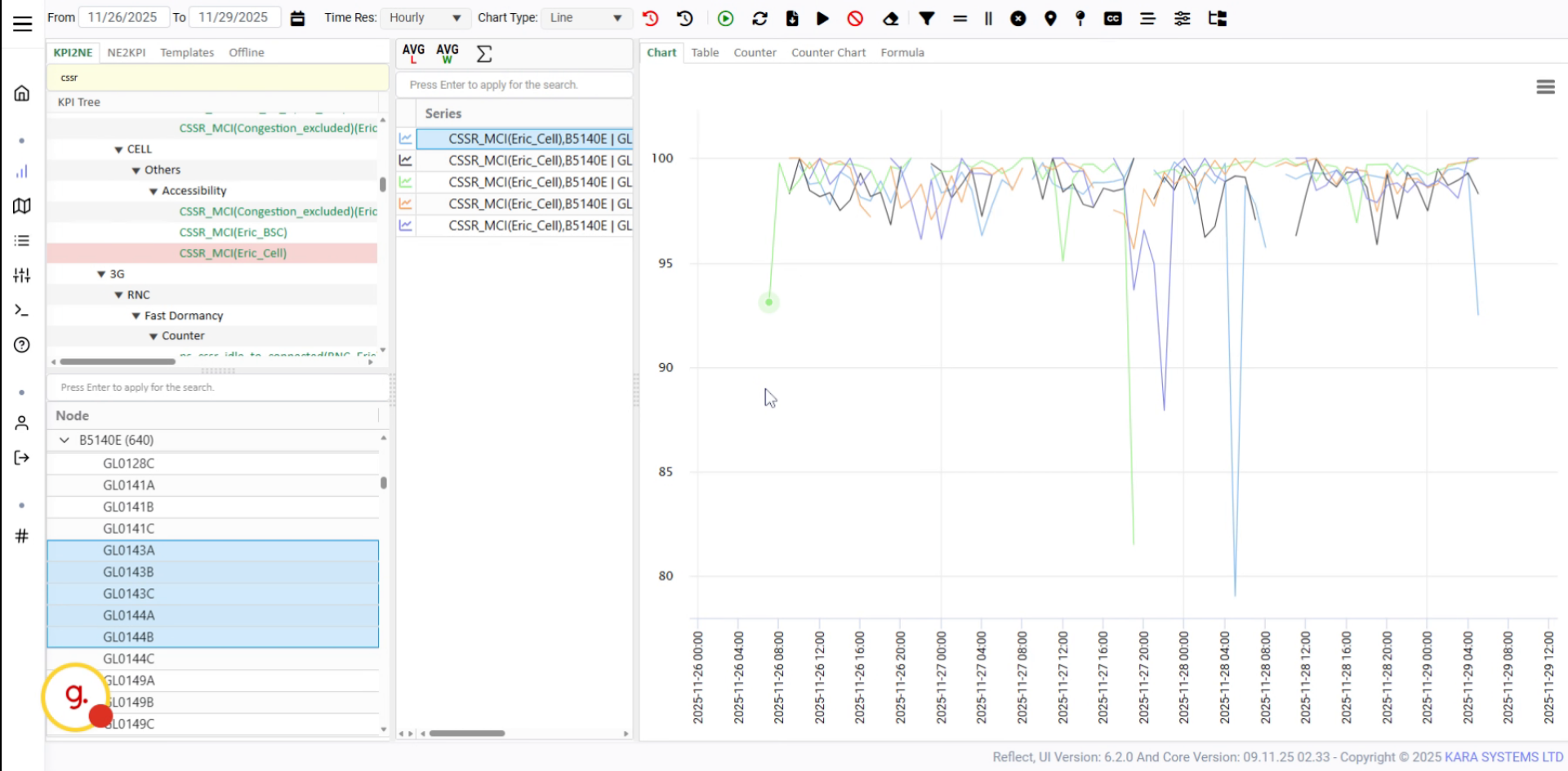
The updated KPI results will appear in the chart view.
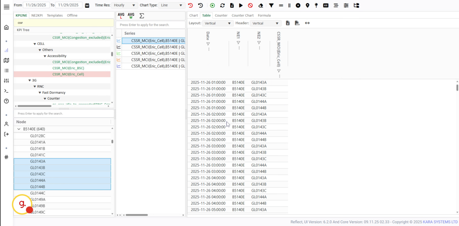
Switch to the table view to see the updated KPI data in tabular format.
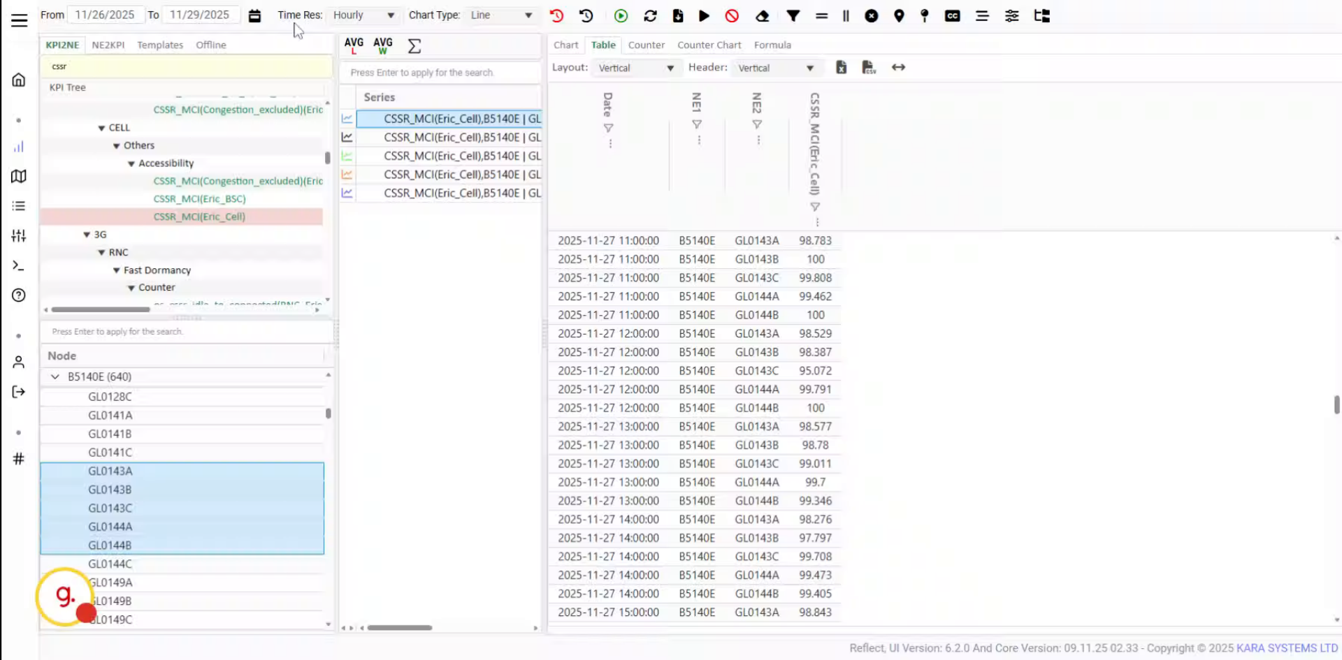
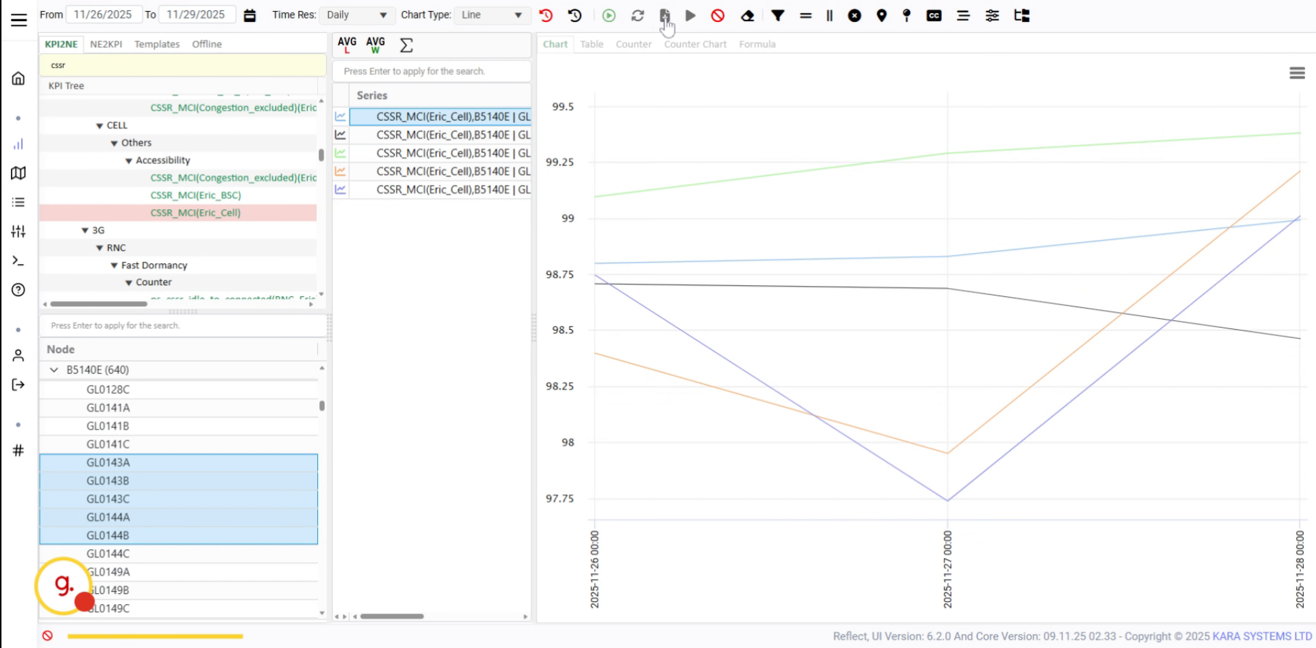
Use the time resolution options to change the granularity of the KPI data.
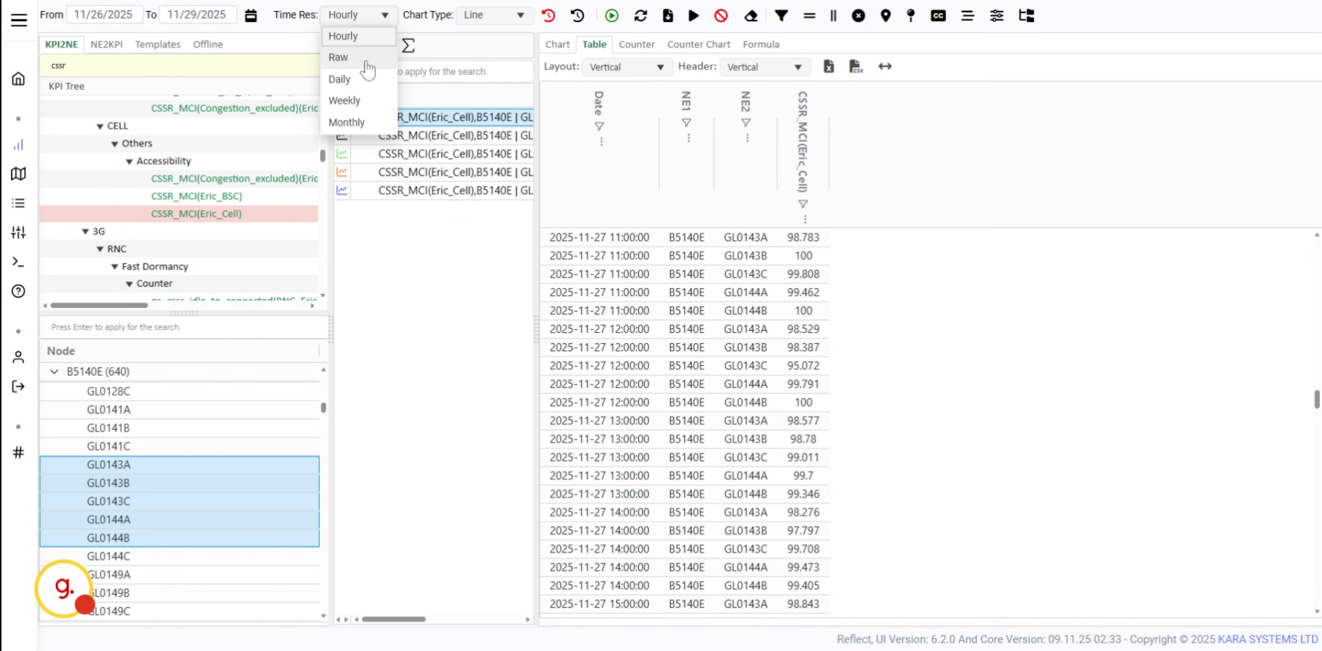
Hourly resolution is selected by default. Other options are also available.
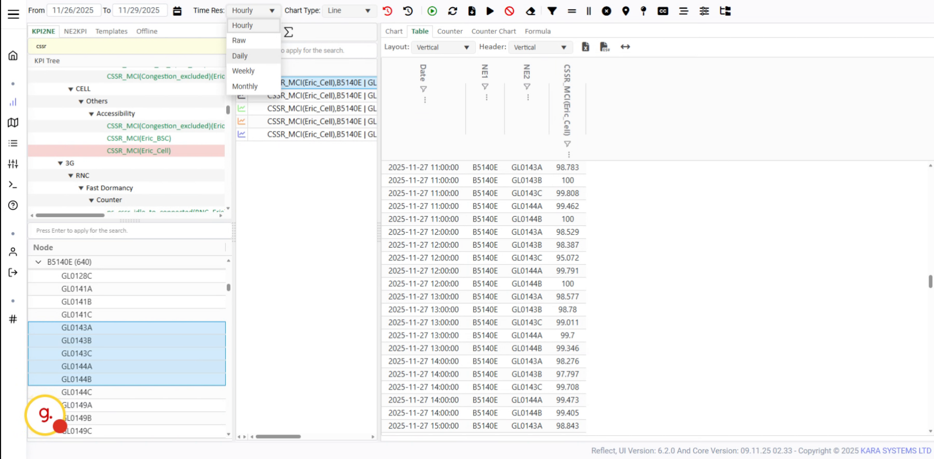
Select Daily and refresh the data to visualize KPI values with daily granularity.
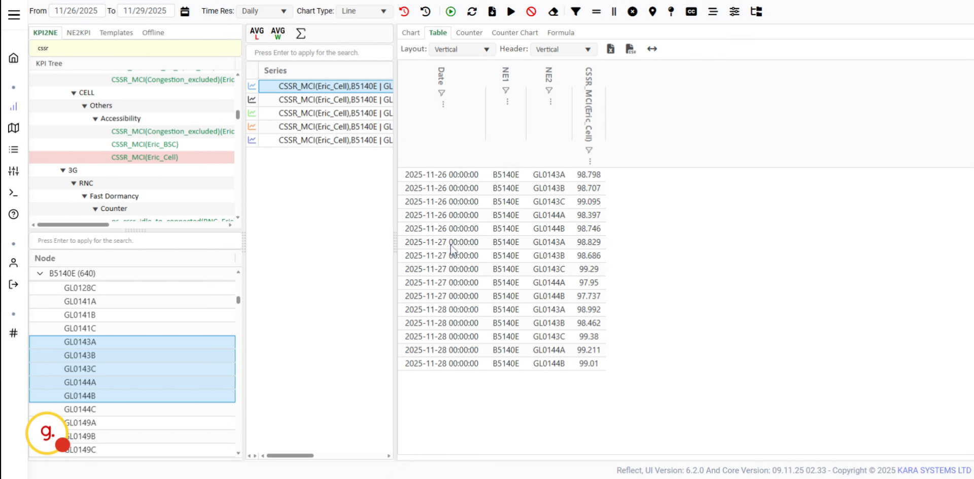
The table view will update and display the KPI data based on daily values.
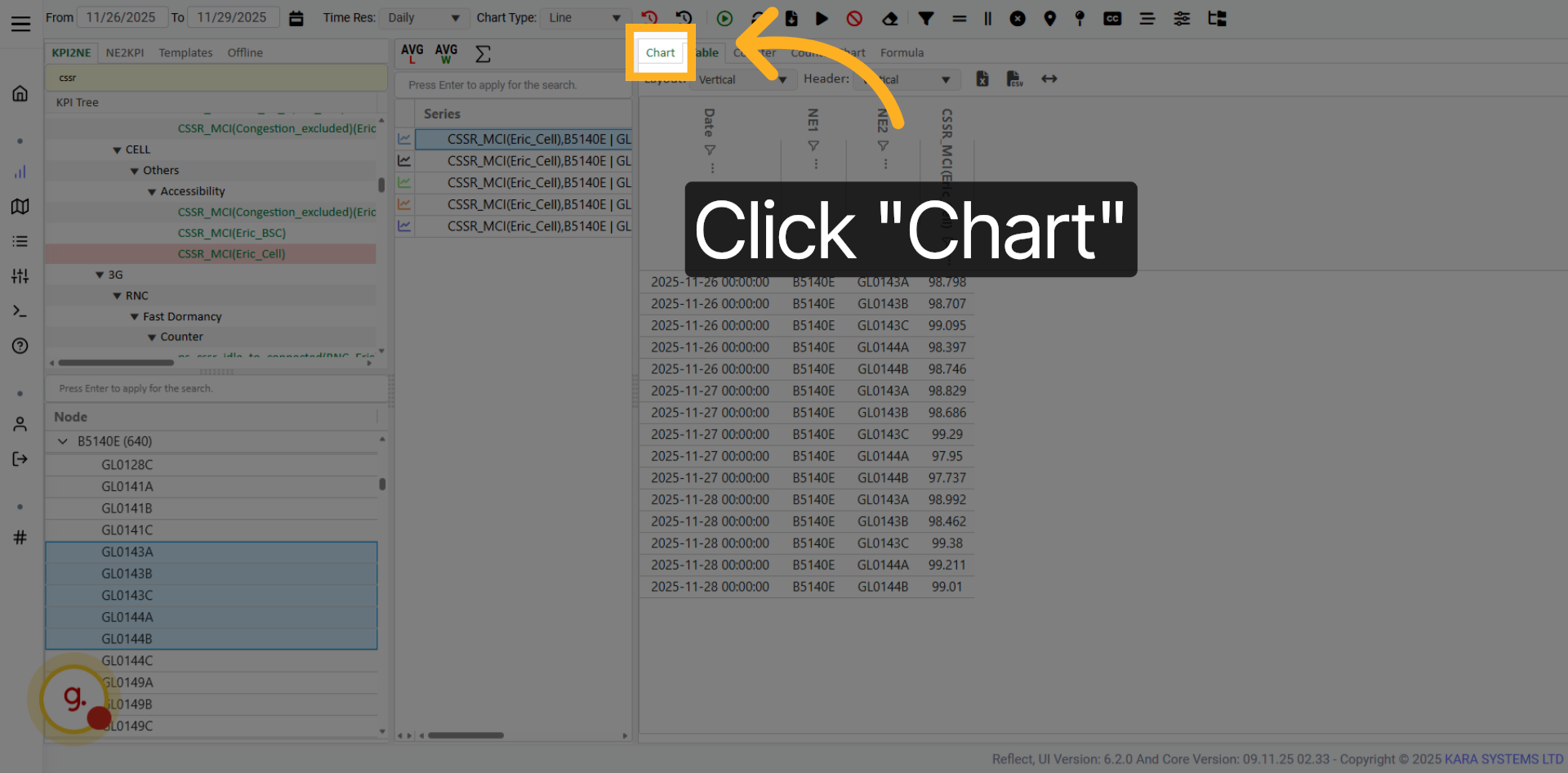
Click Chart to switch the KPI display from table format to chart format.

Select the desired chart type from the available chart options.
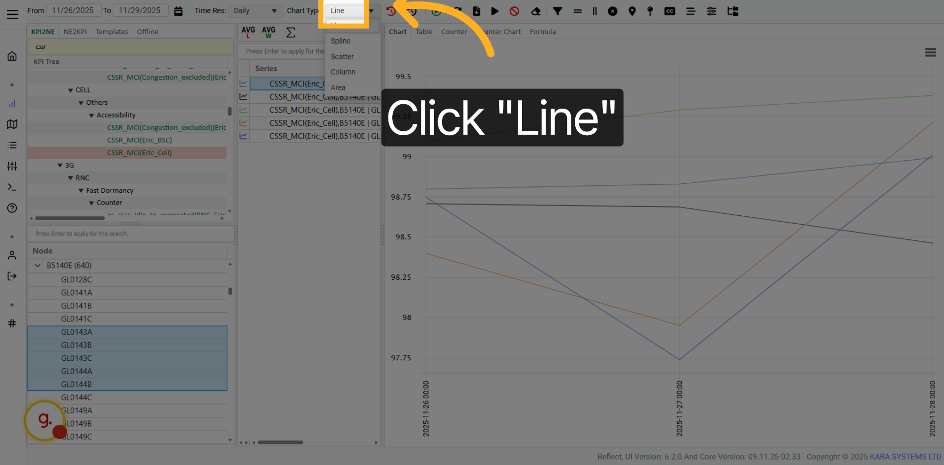
Click Line to display the KPI data as a line chart.

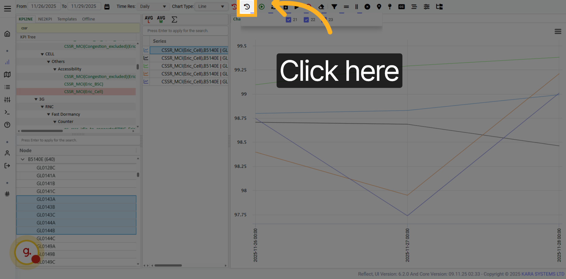
Use this option to activate busy hour calculation for KPI analysis.

Select a fixed time to analyze KPI data based on a specific time configuration.
Click the fixed time selector to open the available time selection options.
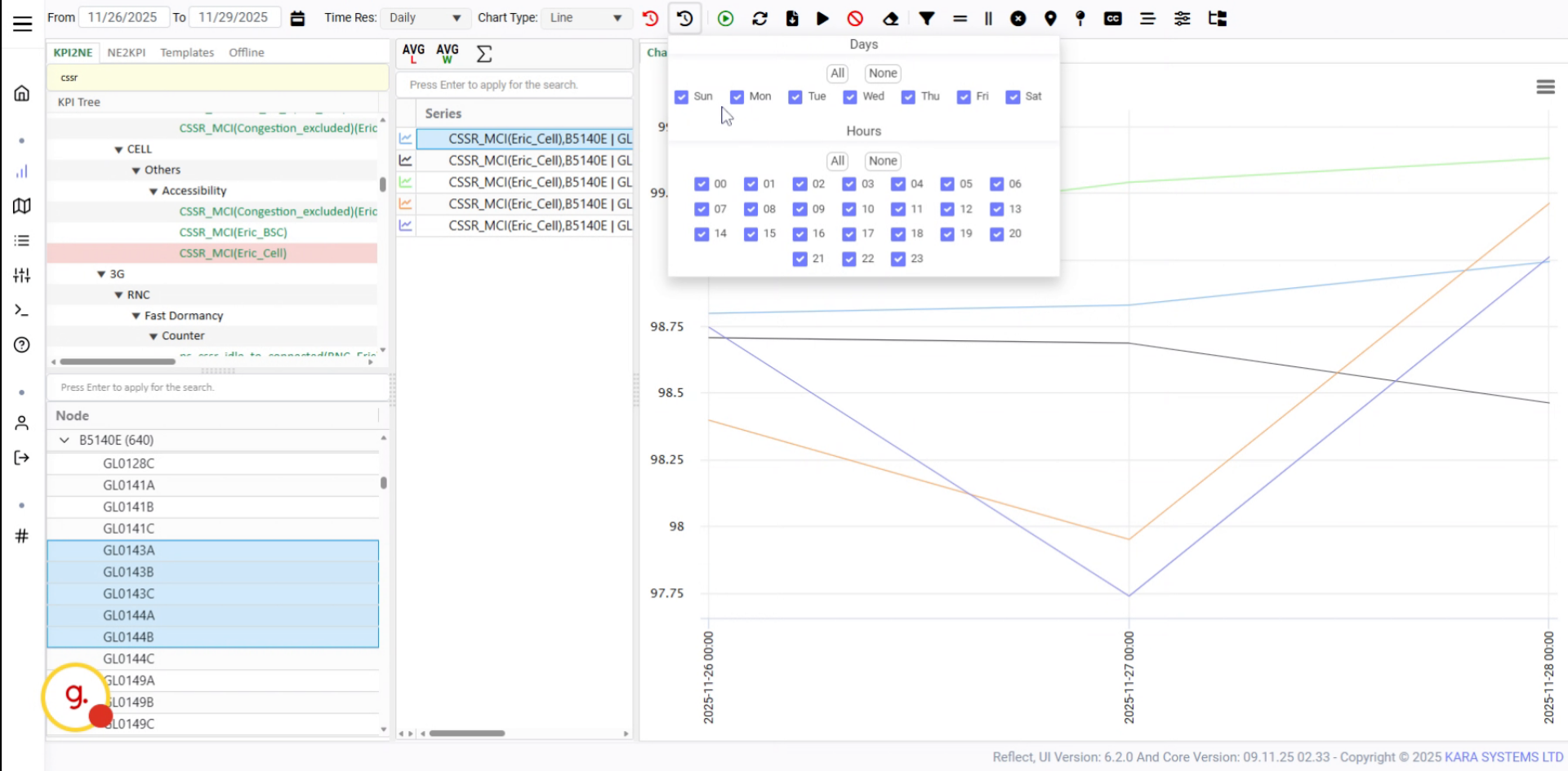
Select the desired day of the week and any previously configured options.
Click the confirmation button to apply your selected day configuration.
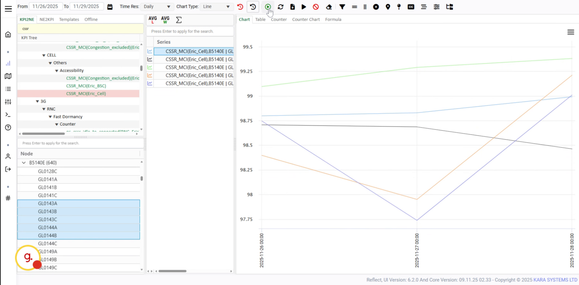
Use the Run button to refresh or reload KPI data.
Click Run to execute the KPI refresh process.
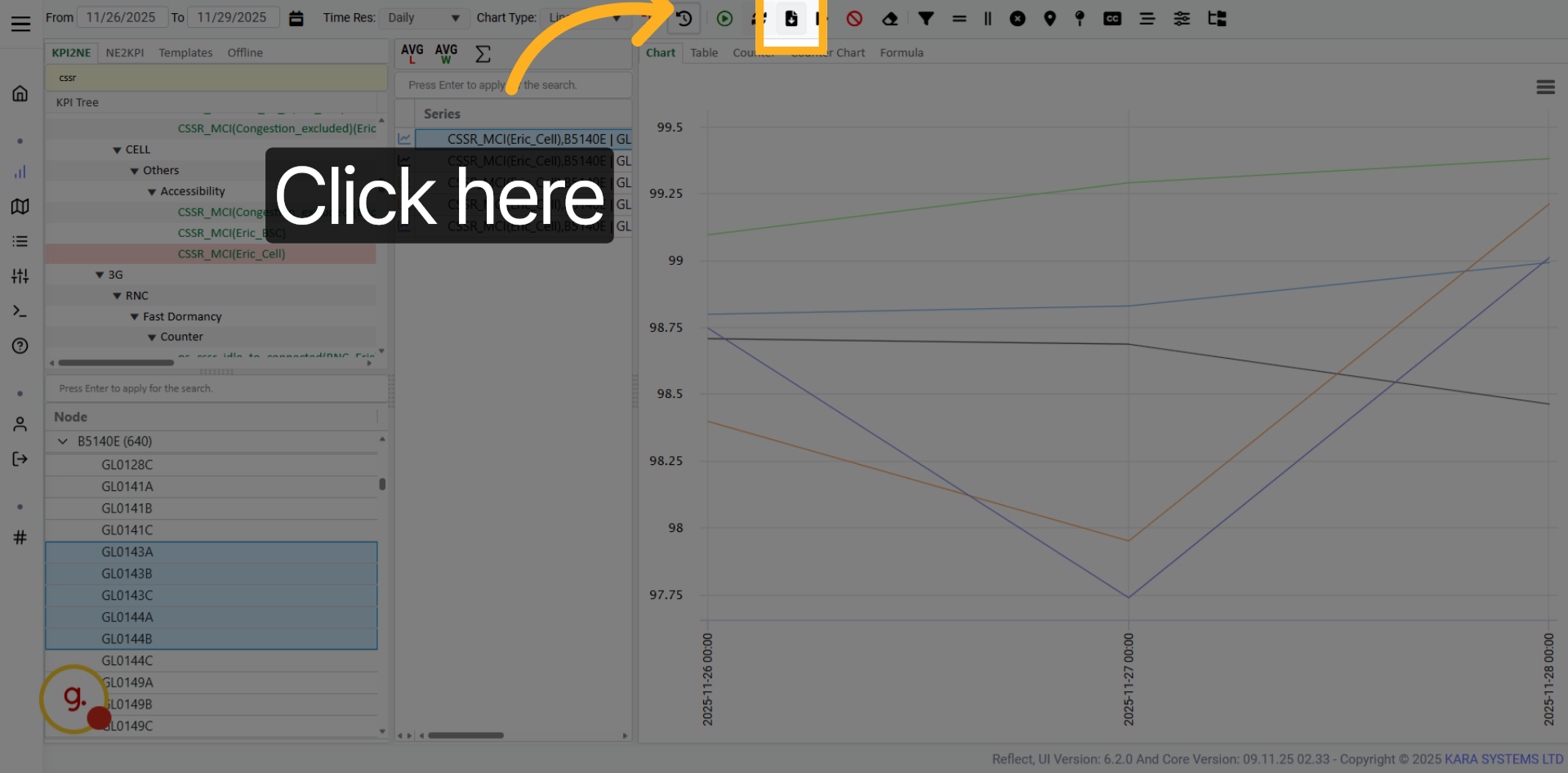
Use the download button to export the selected KPI data in Excel format.

After clicking download, an Excel file will be downloaded in your browser.
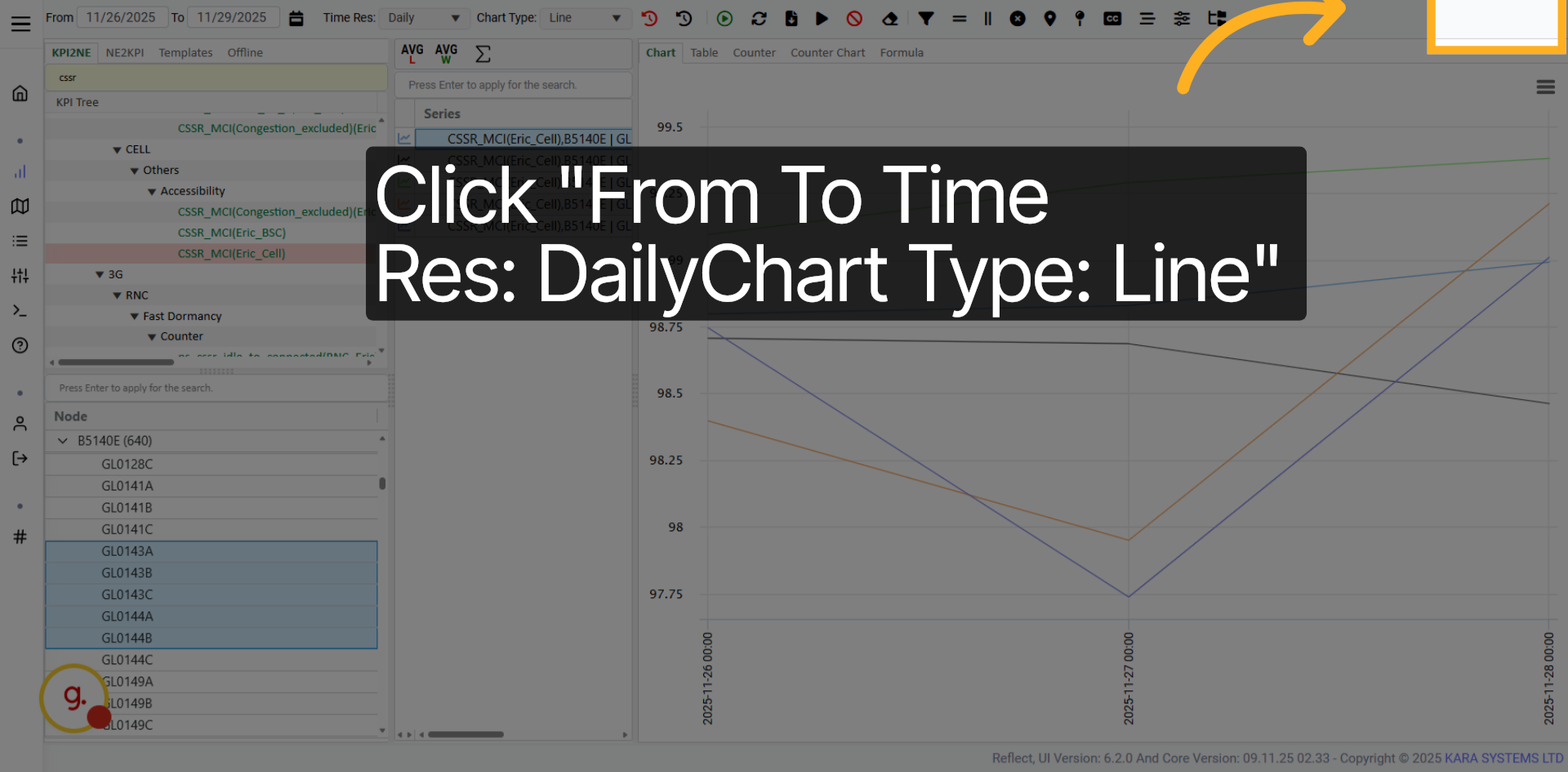
Use the settings to confirm daily time resolution and line chart type.

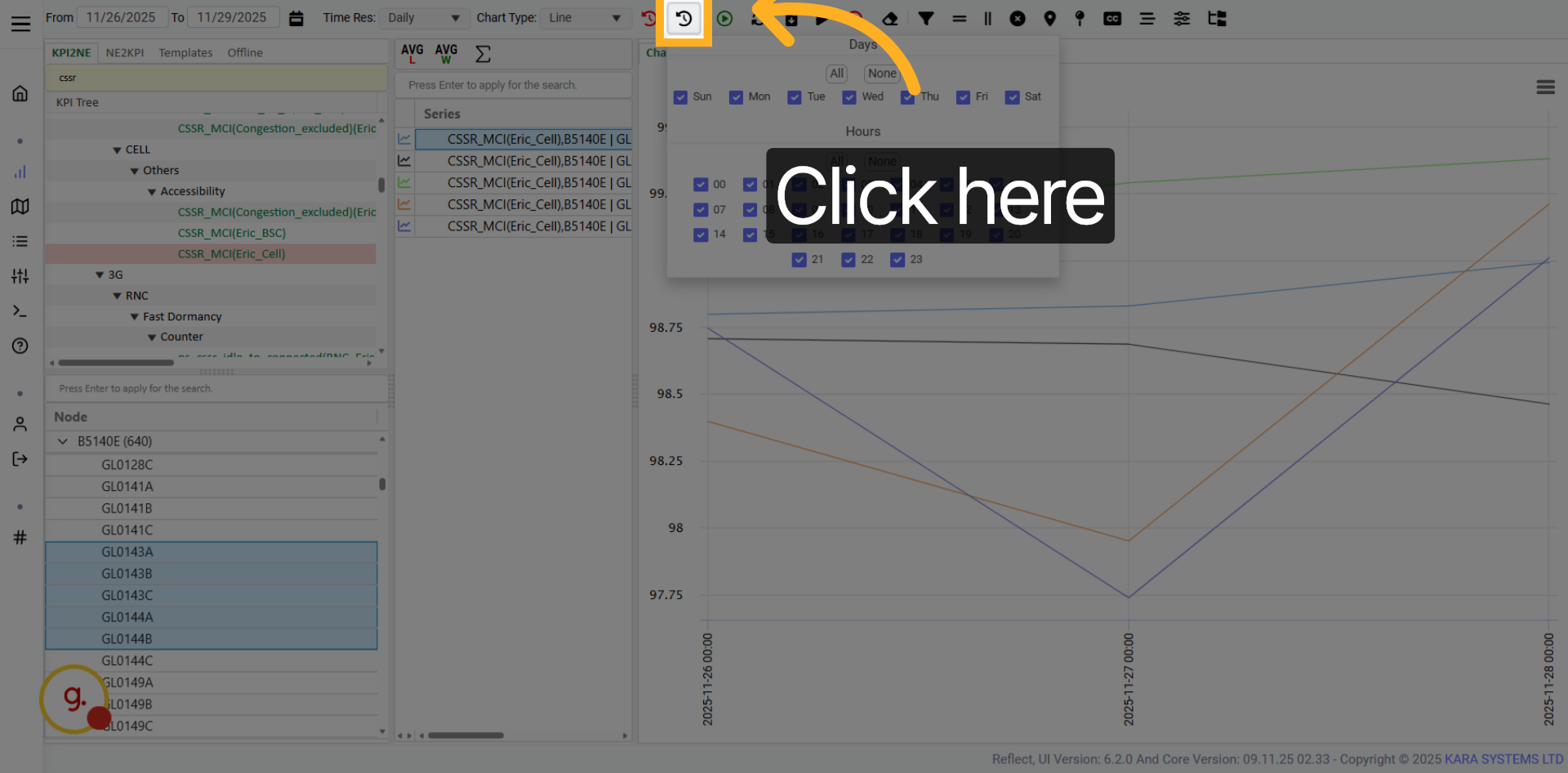
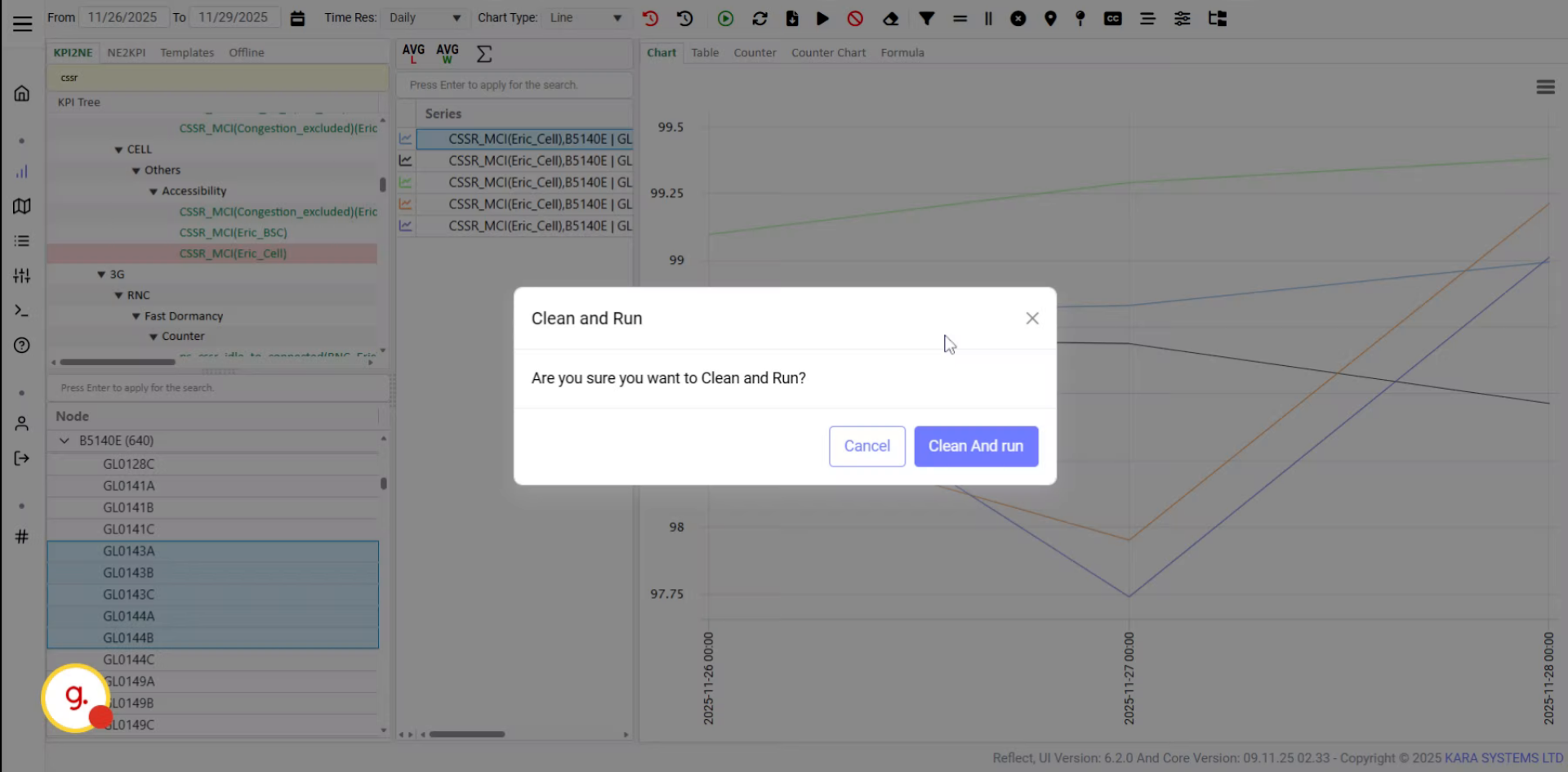
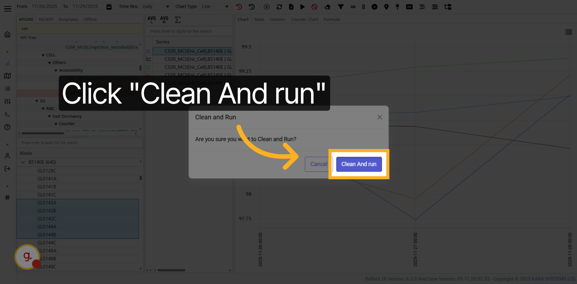
Clean the current chart and run a fresh KPI data refresh.
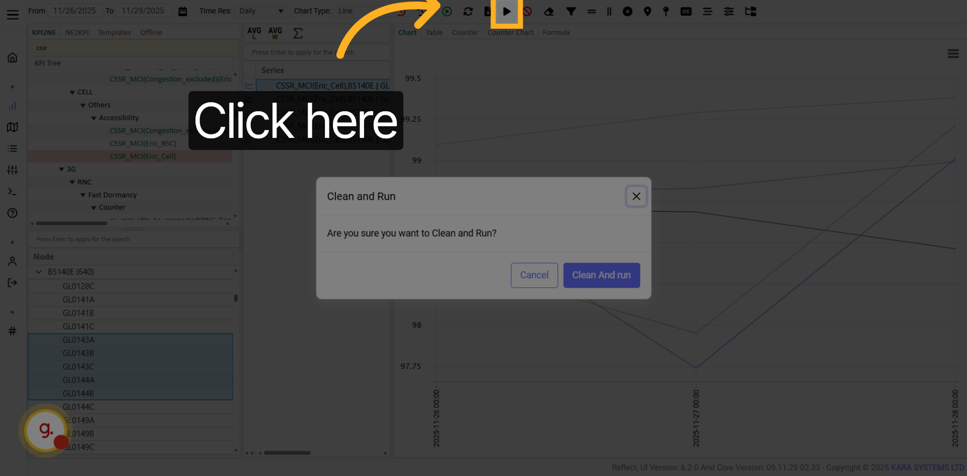
Click Clean and Run to clear existing chart data and execute a new refresh.
Use the Cancel button when a KPI execution is too heavy or taking too long.
The progress bar appears while KPI data execution is running.
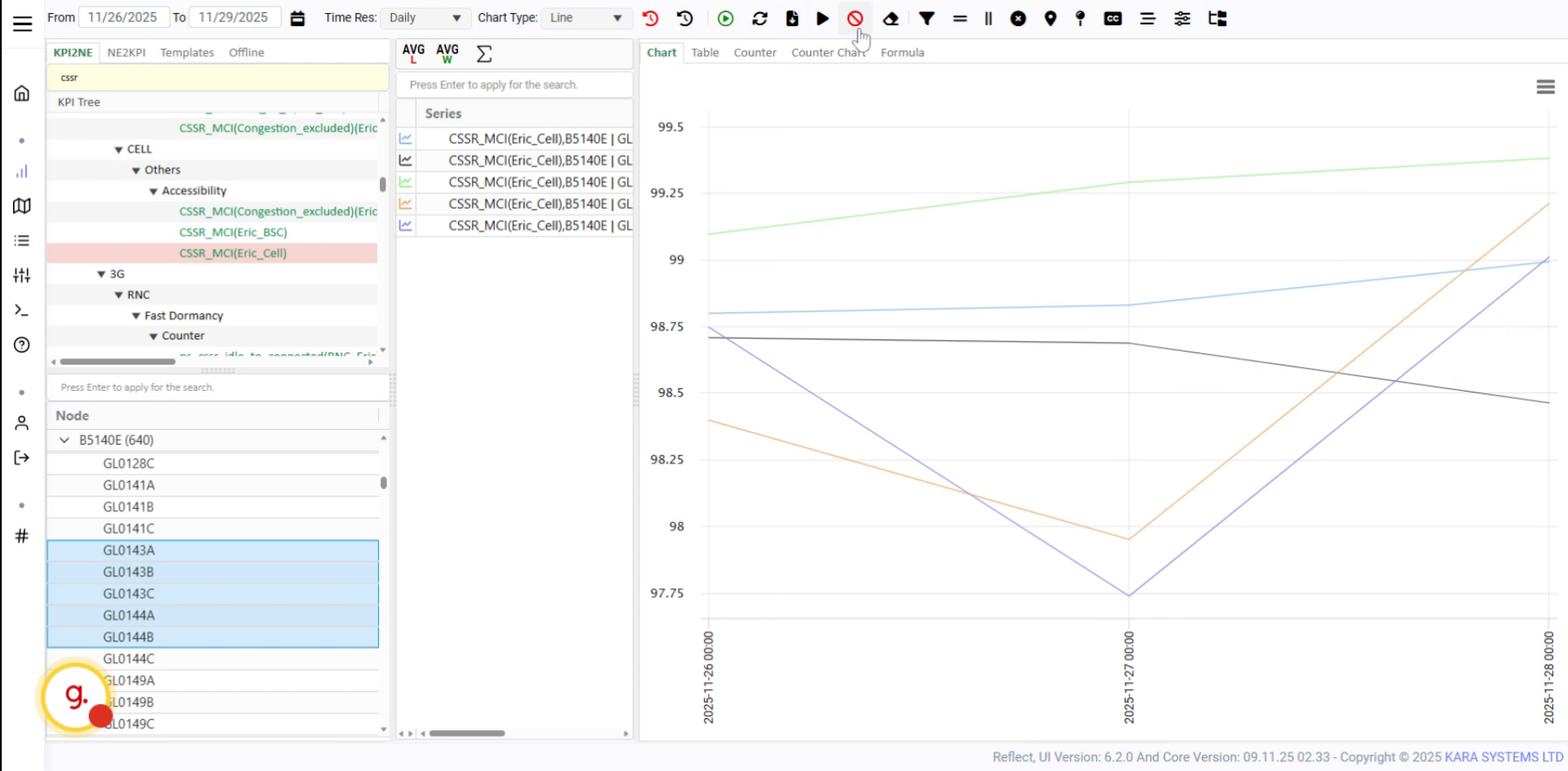
Click Cancel to stop the execution progress.

Click Clean to clear the current chart data.
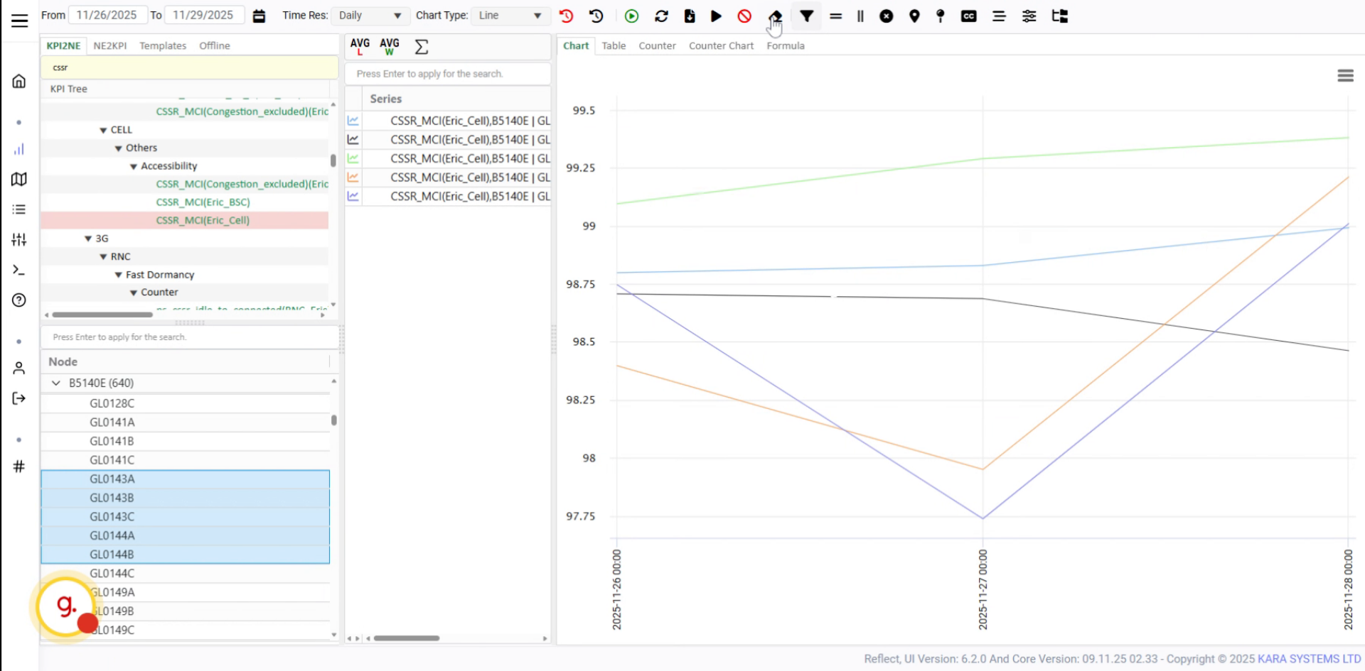
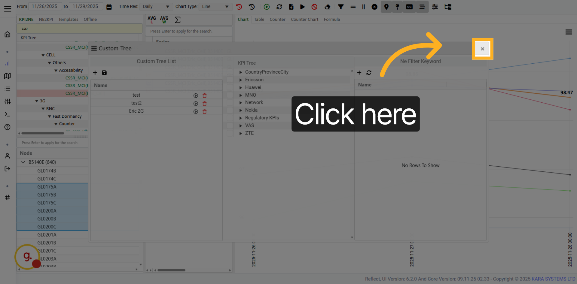
Open the chart cleaning options to manage chart data cleanup.
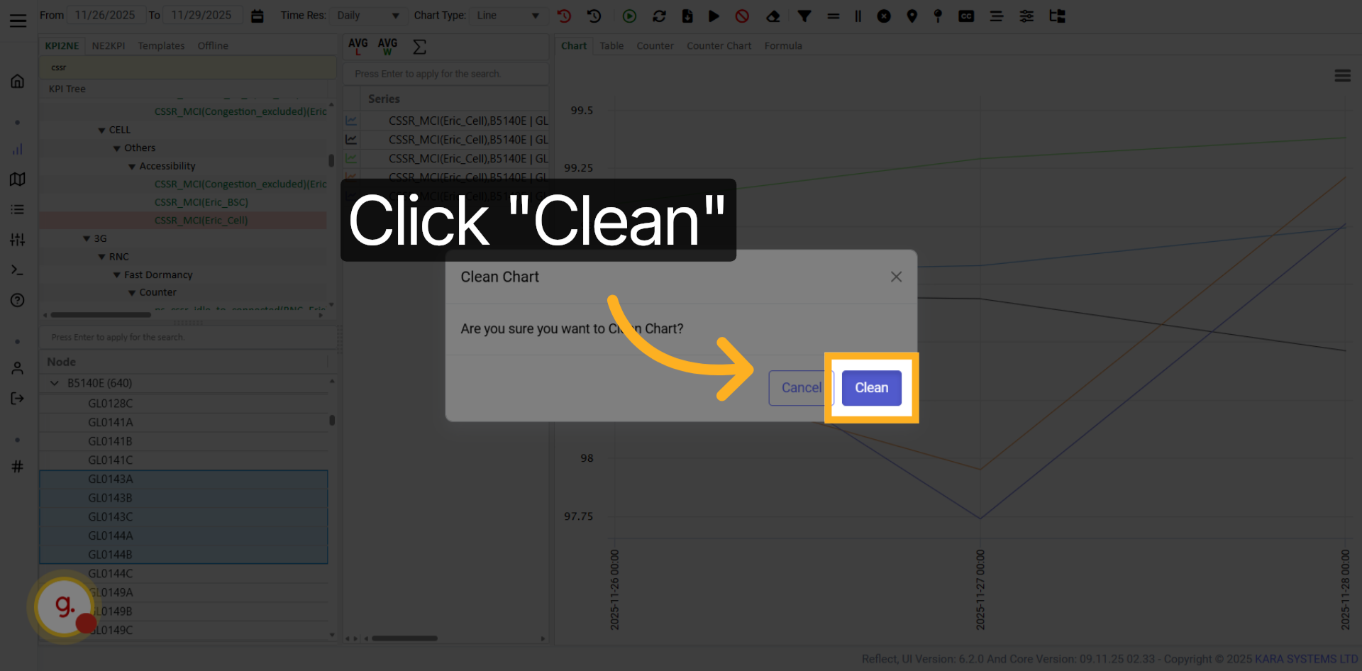
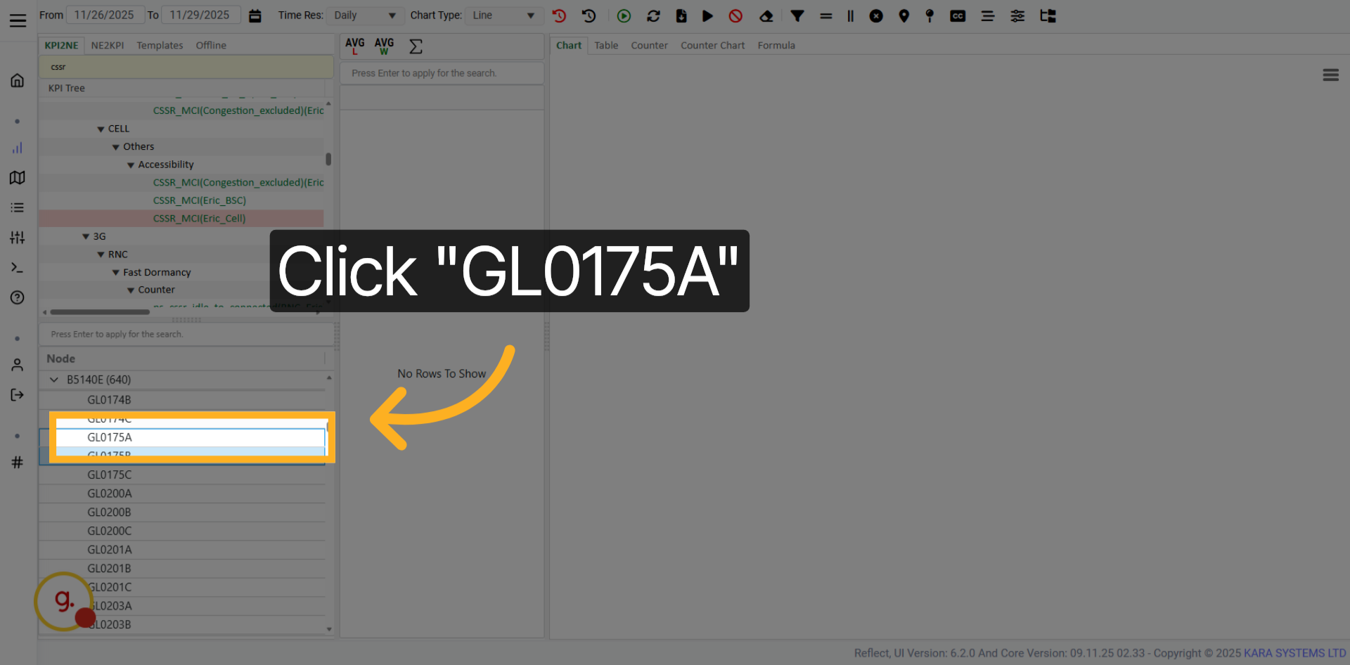
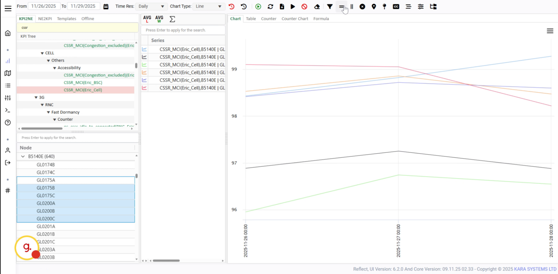
Chart filters allow you to filter KPI data by different categories or areas.
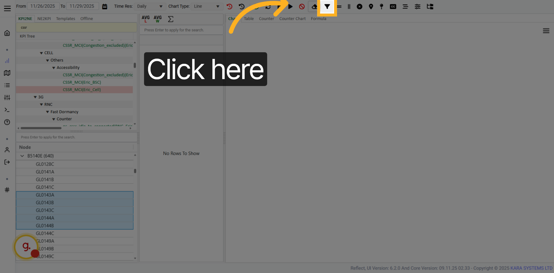
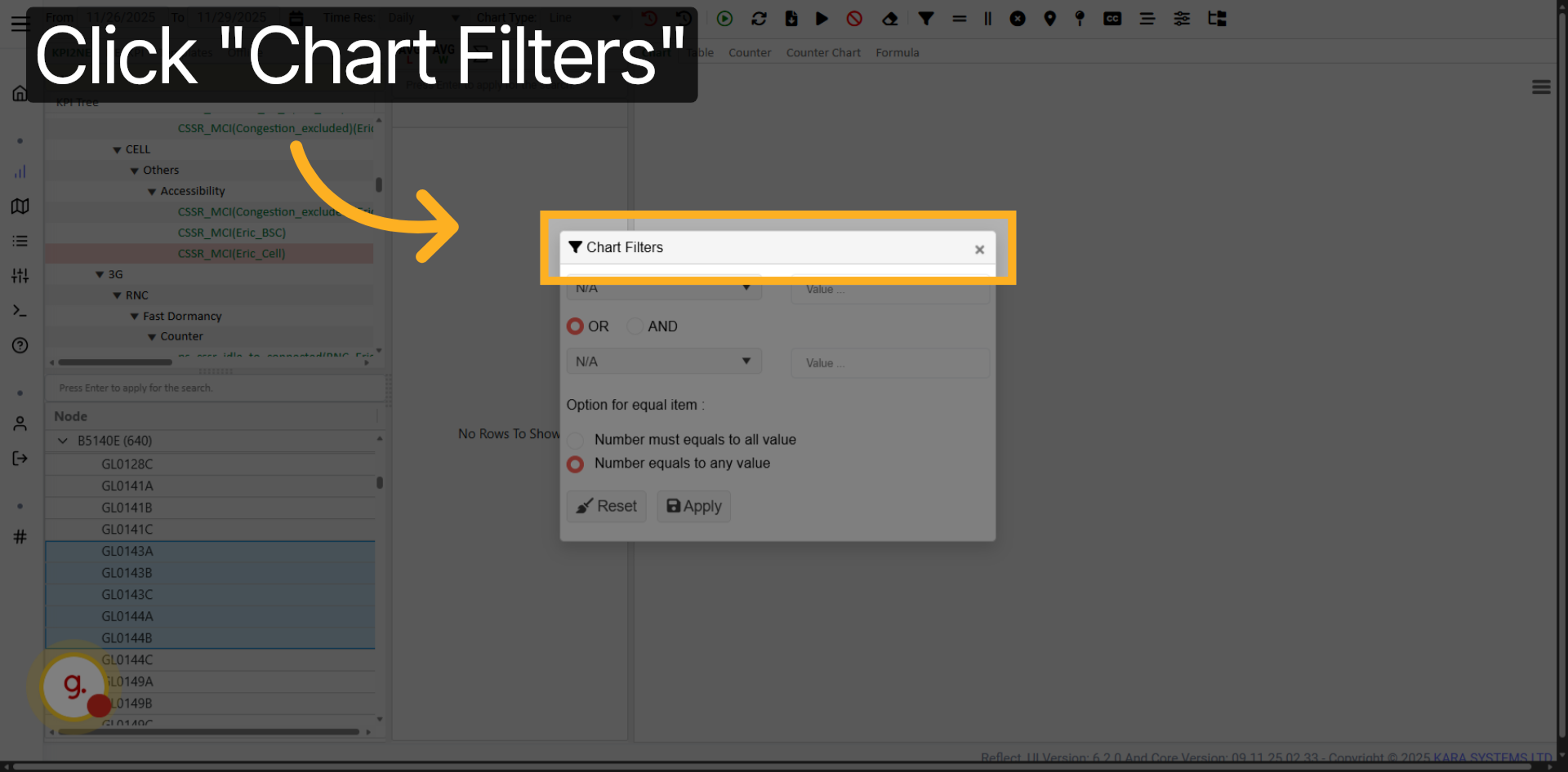
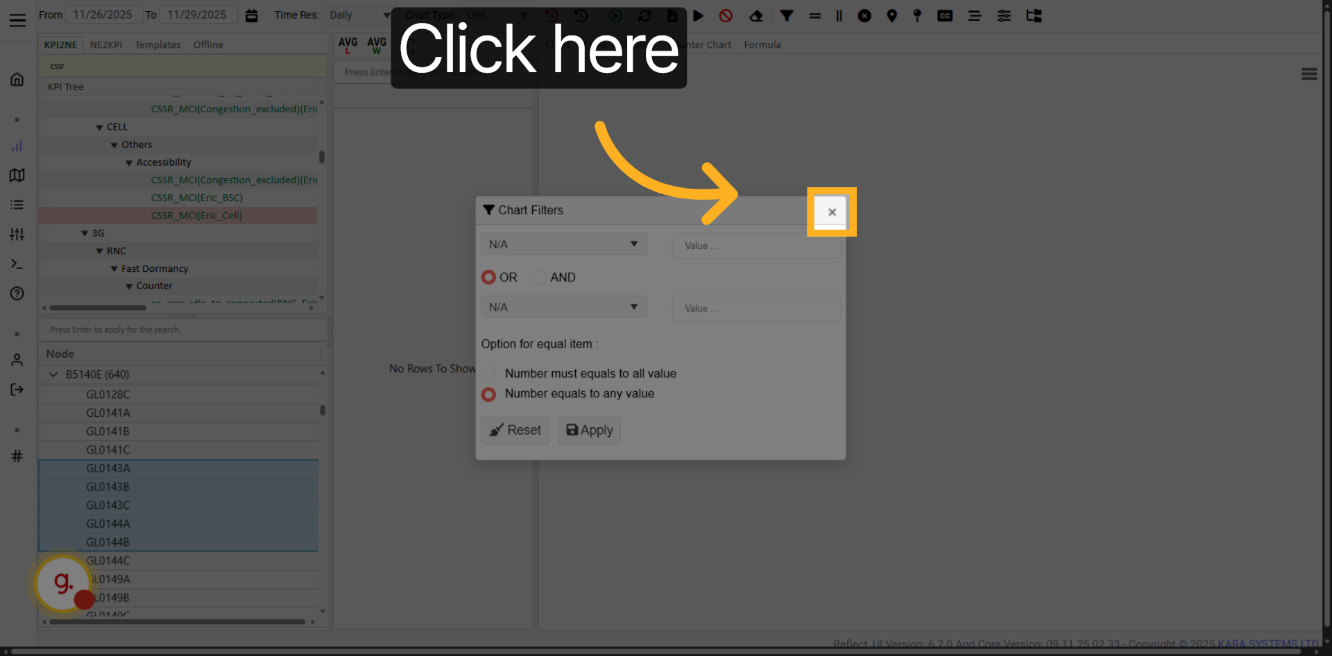
Click Chart Filters to open the available filtering options.
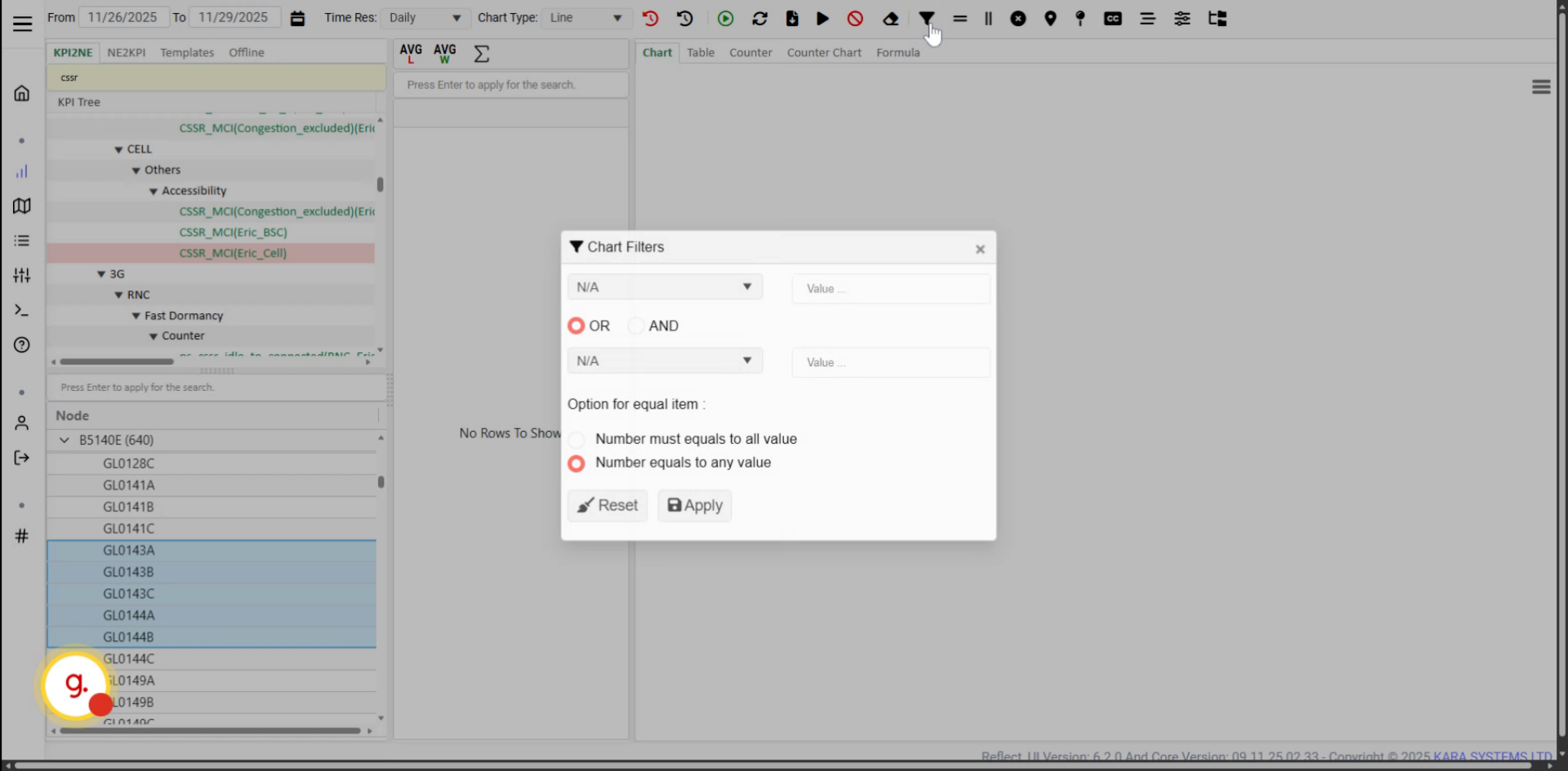
Open the filter options to select the desired KPI data filter.
Select the appropriate filter category for your KPI data.
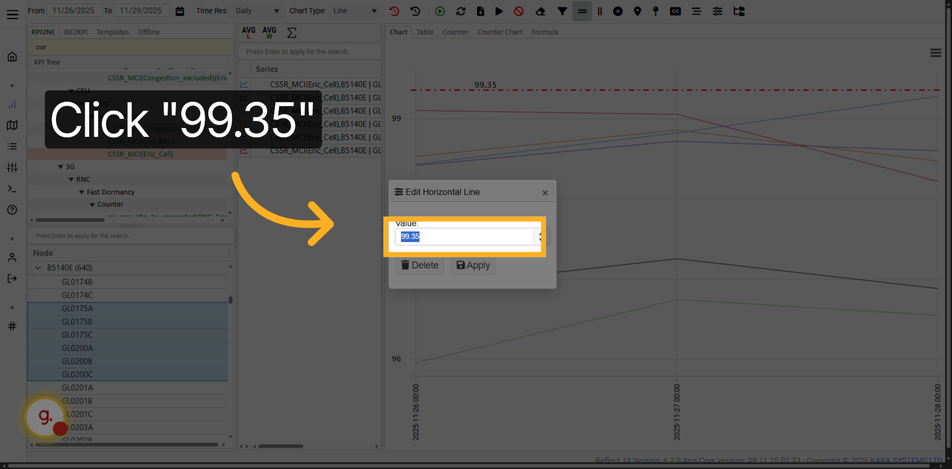
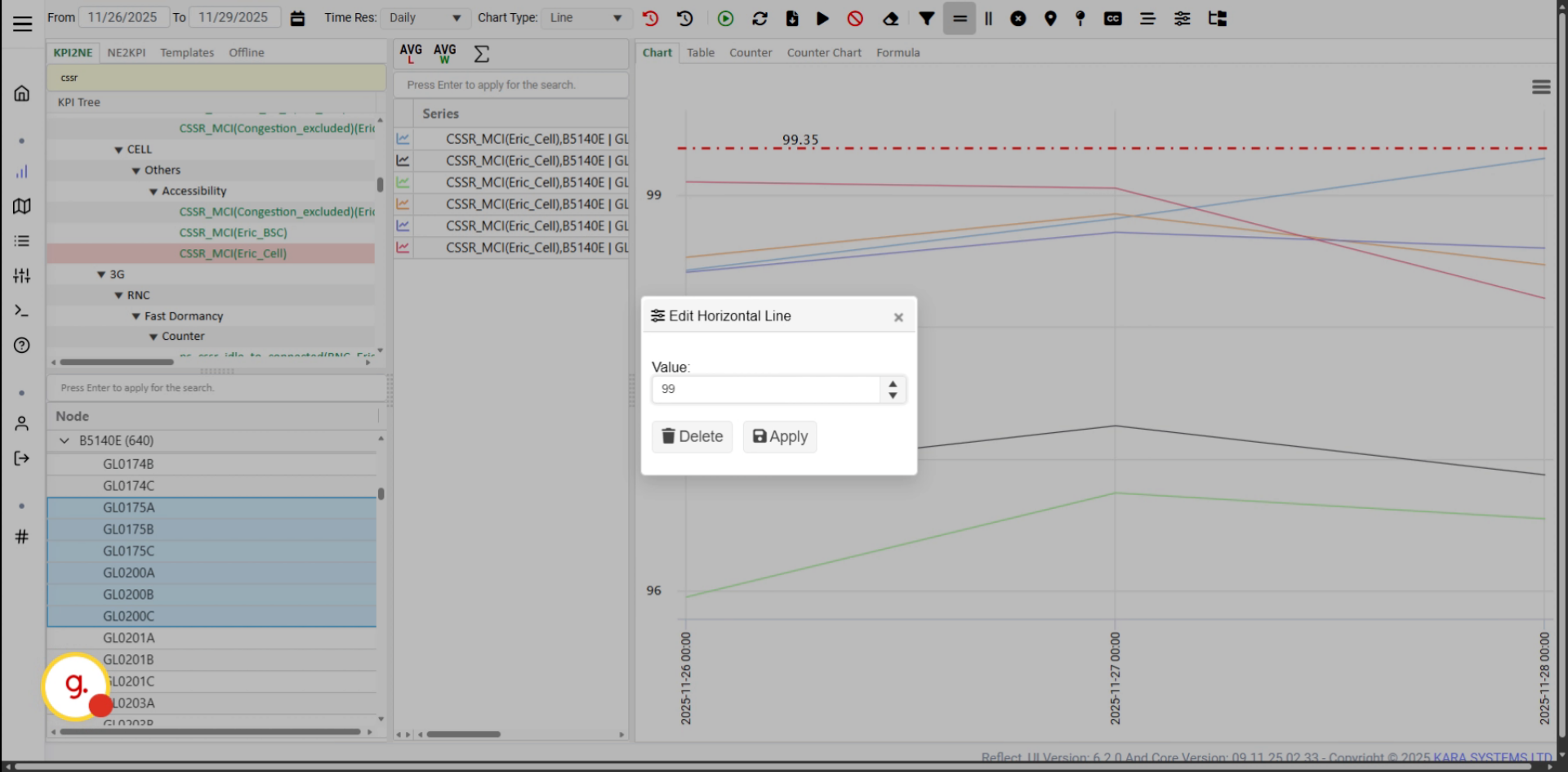
Use horizontal ratios to add horizontal reference lines to your chart.
Click the horizontal ratio value and adjust it based on your analysis needs.
Apply your design changes to update the chart visualization.
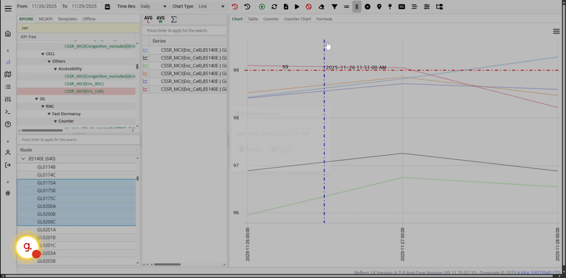
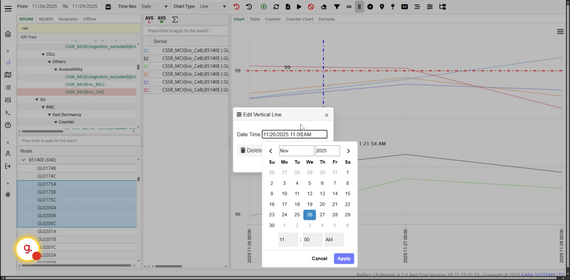
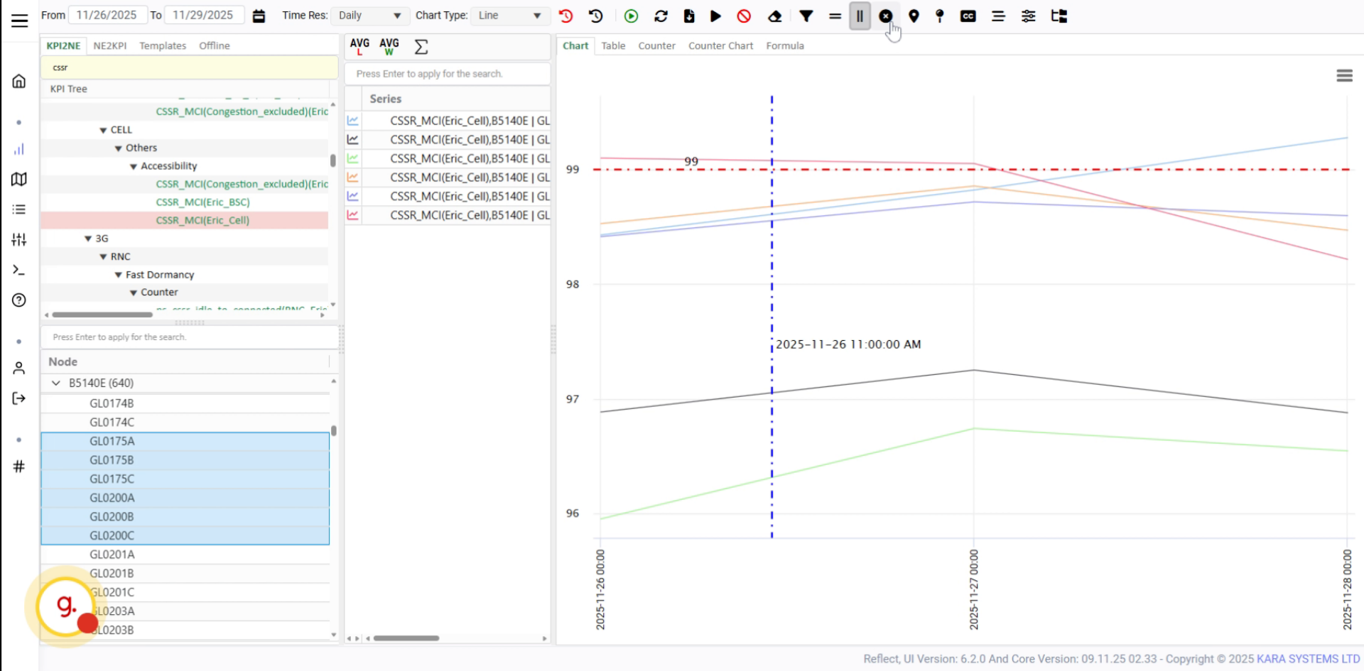
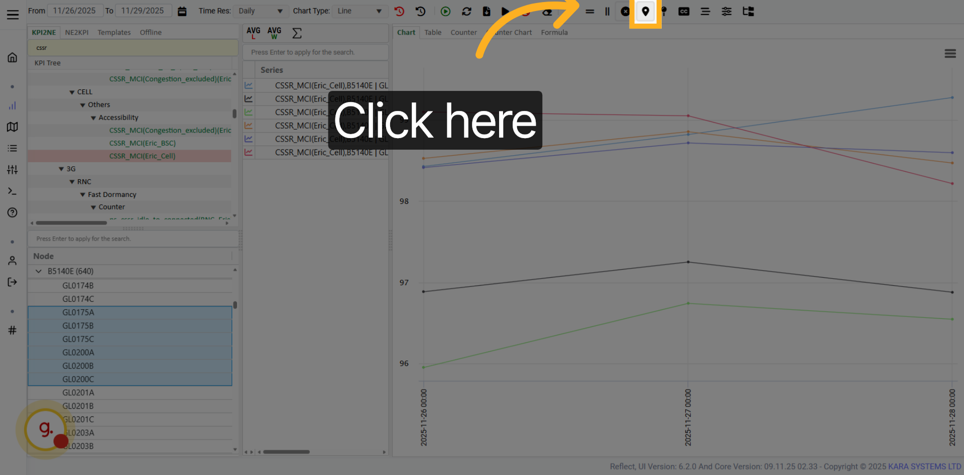
Add vertical lines to your chart to highlight specific time points or events.
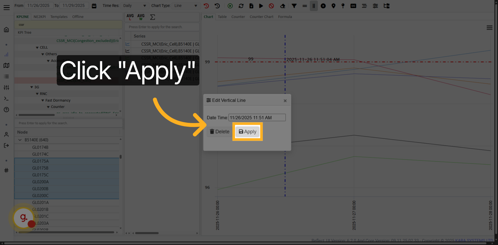
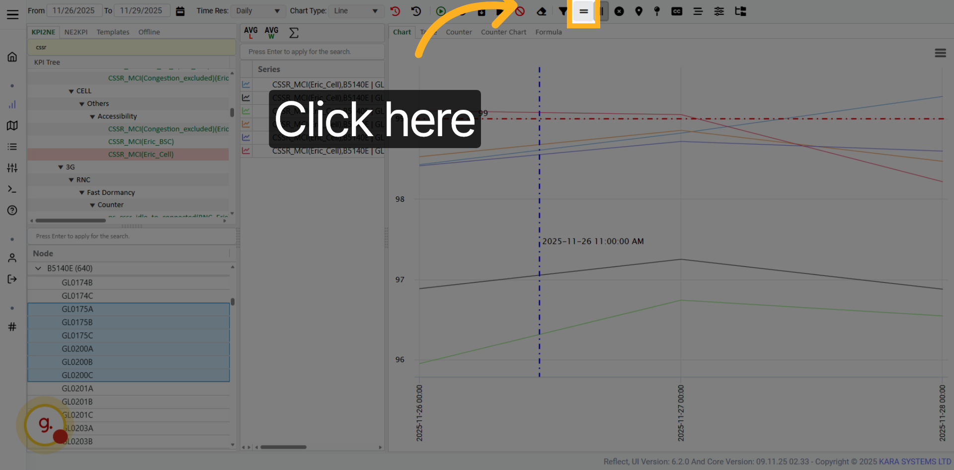
Show the date and time on the chart. Click again if you want to reposition the text.
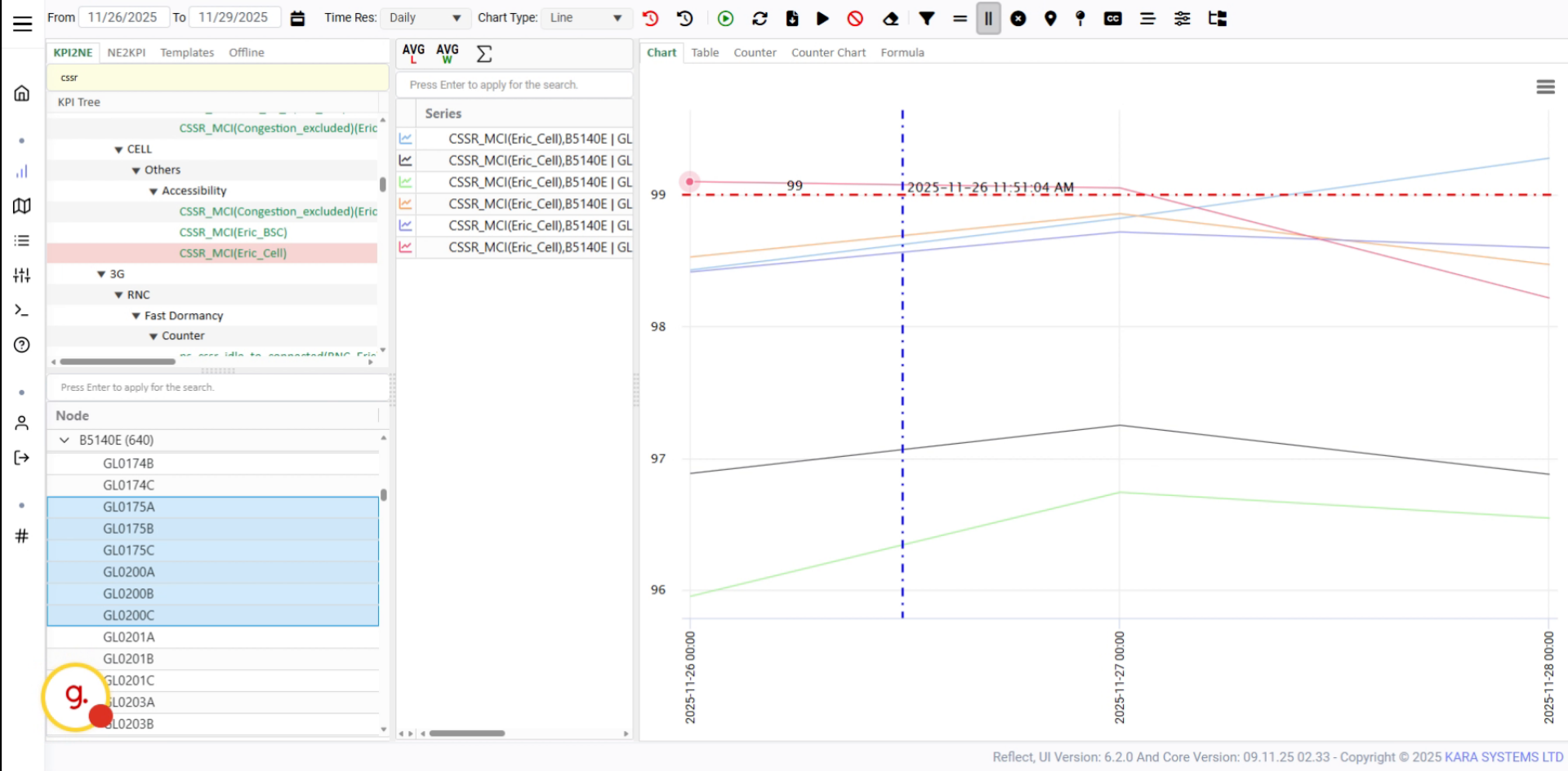
Click Apply to confirm the date and time display settings.
Open the date and time settings to adjust how date/time labels appear on the chart.
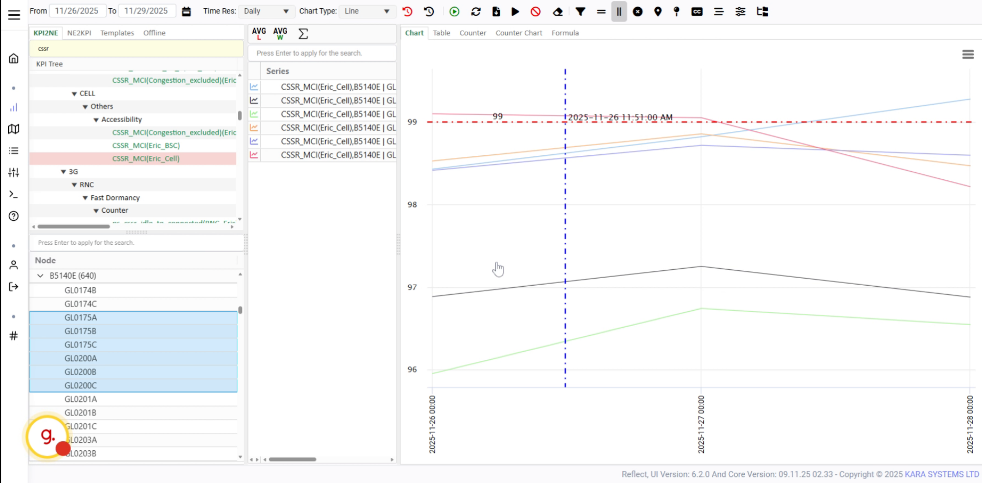
Delete the current date/time label and place it again in a better position.
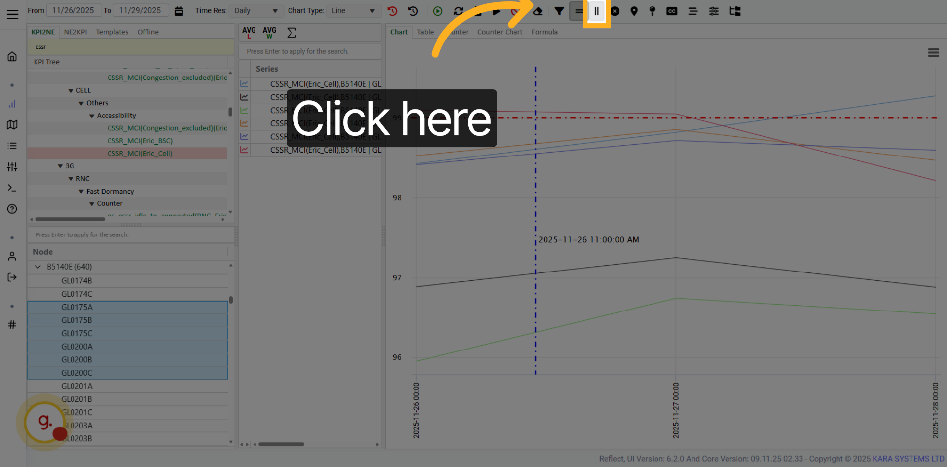
Use the value settings section to adjust how values are displayed on the chart.
Click Apply to confirm value display changes.
Use the Apply button to confirm chart changes and clean evaluations if needed.
Confirm the action to clean all evaluations from the chart.
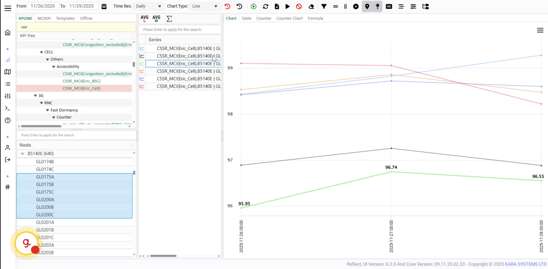
Use this button to activate visible data points on the chart.
Click the option to enable point display on the chart.
Enable labels when clicking items in the chart legend.
The chart will show labels with the value of the selected counter or KPI.
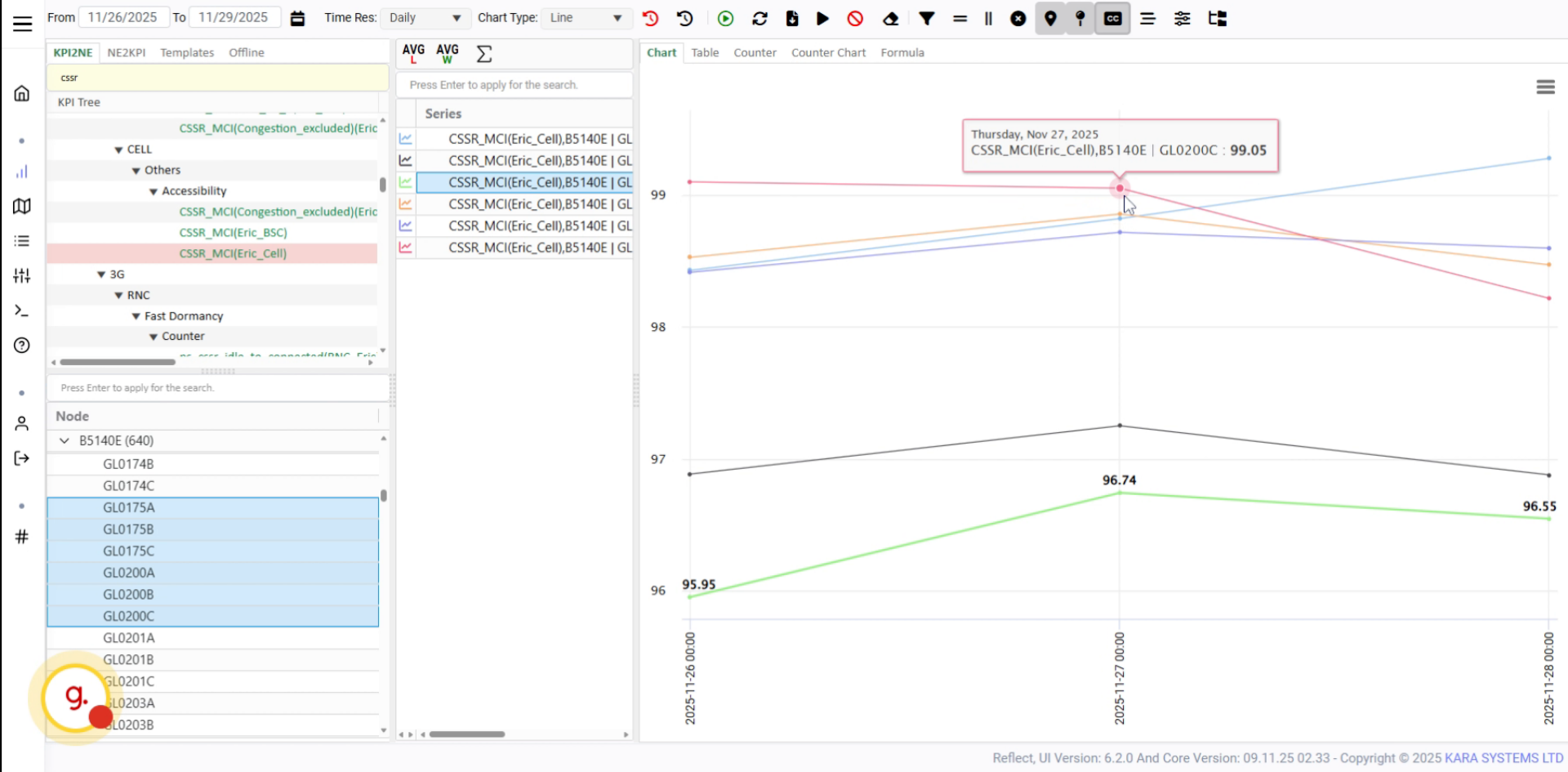
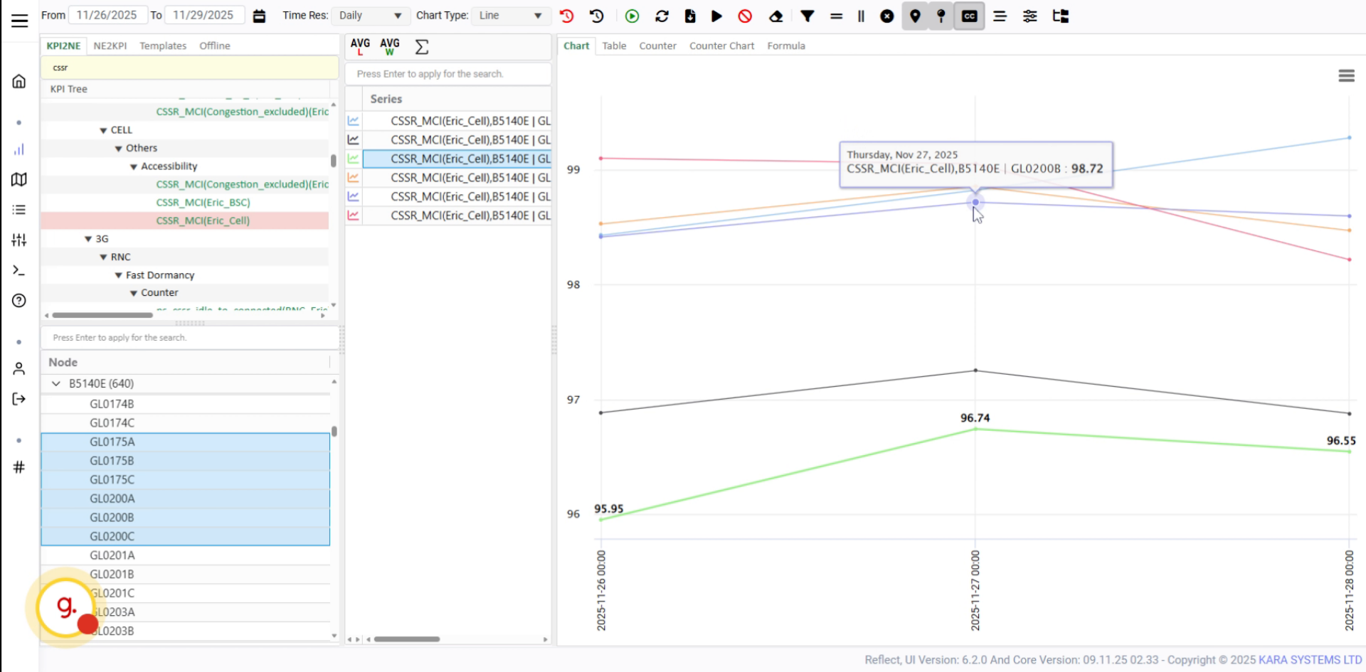
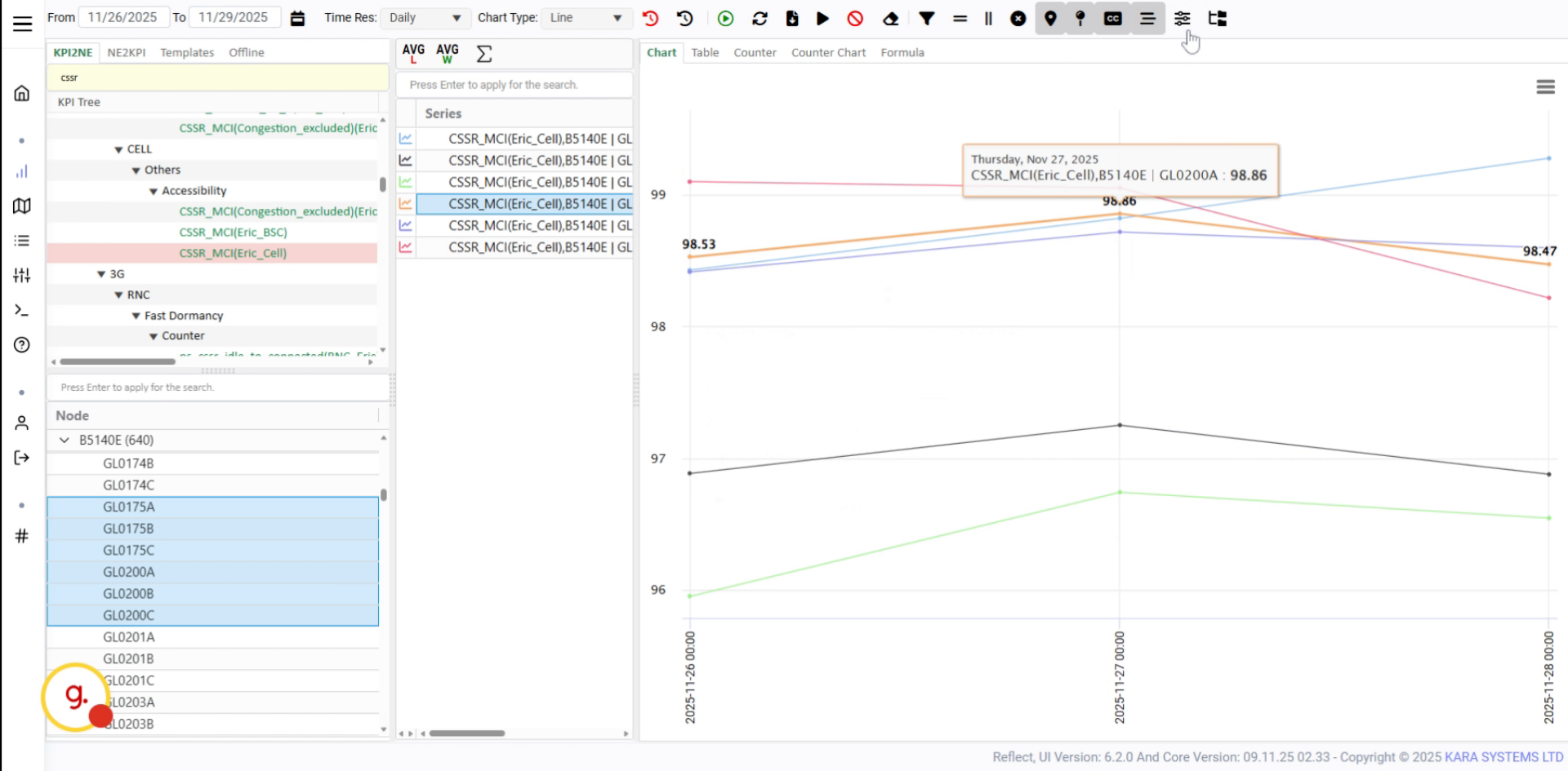
Activate the tooltip feature to display additional KPI information on hover.
Hover over chart points to view tooltip information such as date, KPI name, and value.

The tooltip displays the counter name and the value for the selected KPI point.
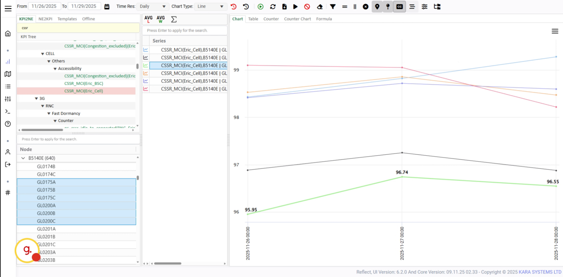
Open the More section to access additional chart display options.
Use this option to manage items that are not shown directly in the legend while hovering on charts.
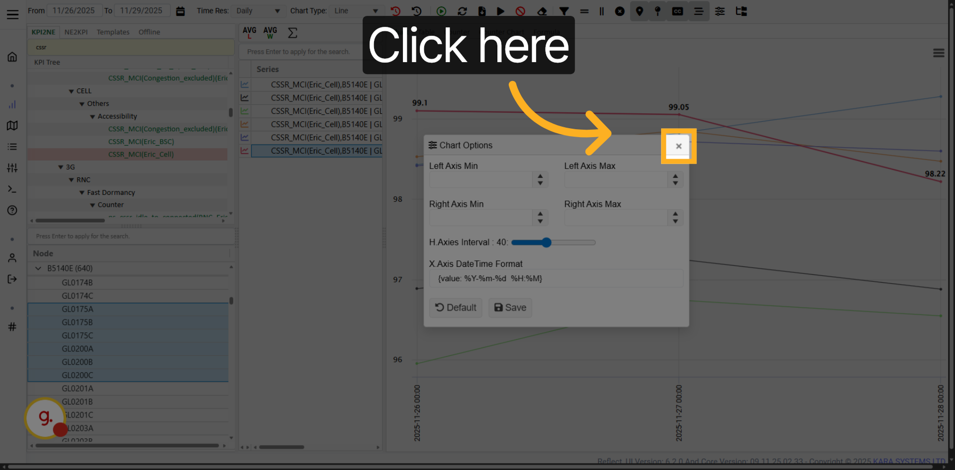
Open Chart Options to configure left and right axis settings.

Set minimum and maximum axis values, intervals, and data formats.
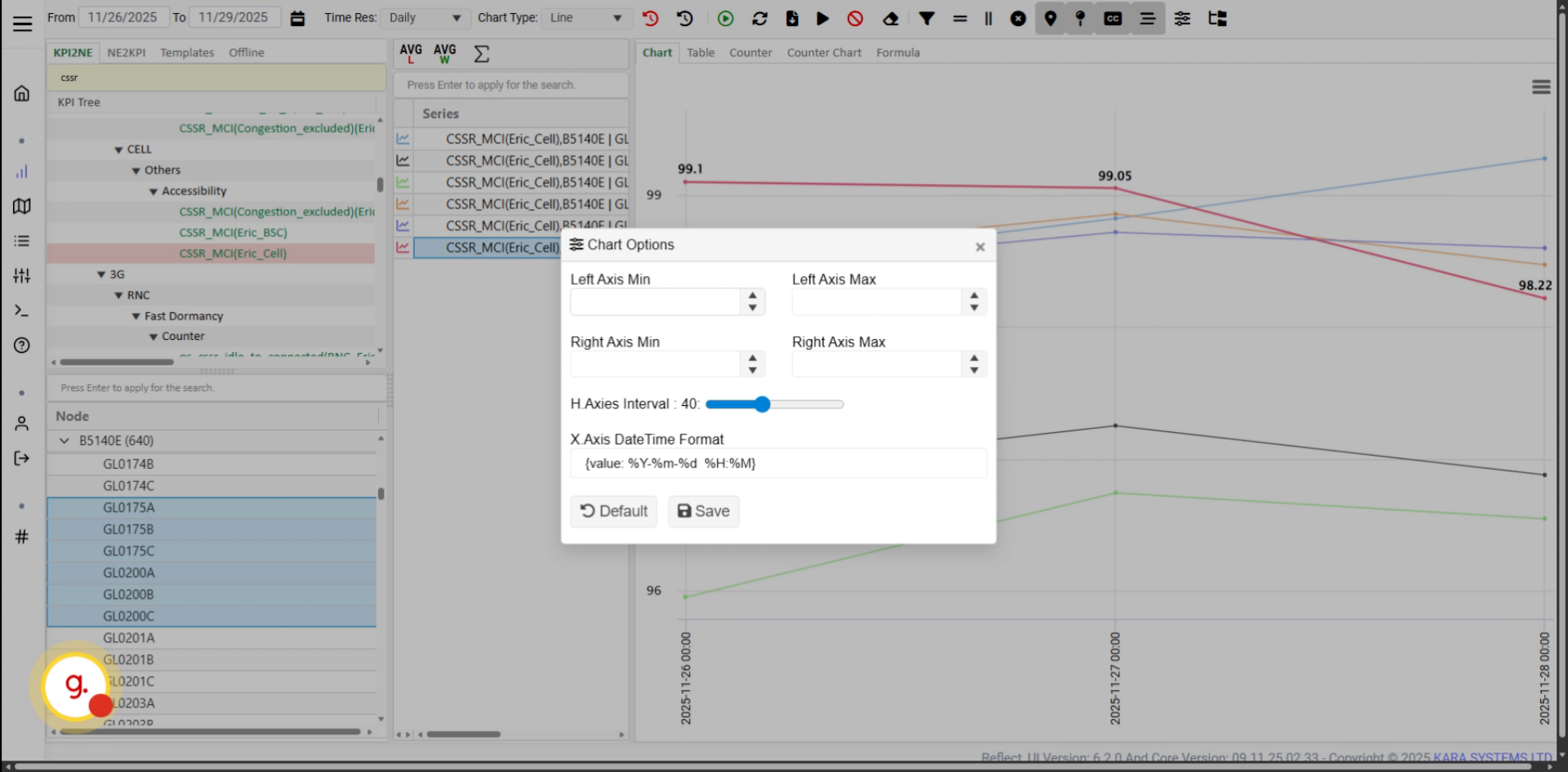
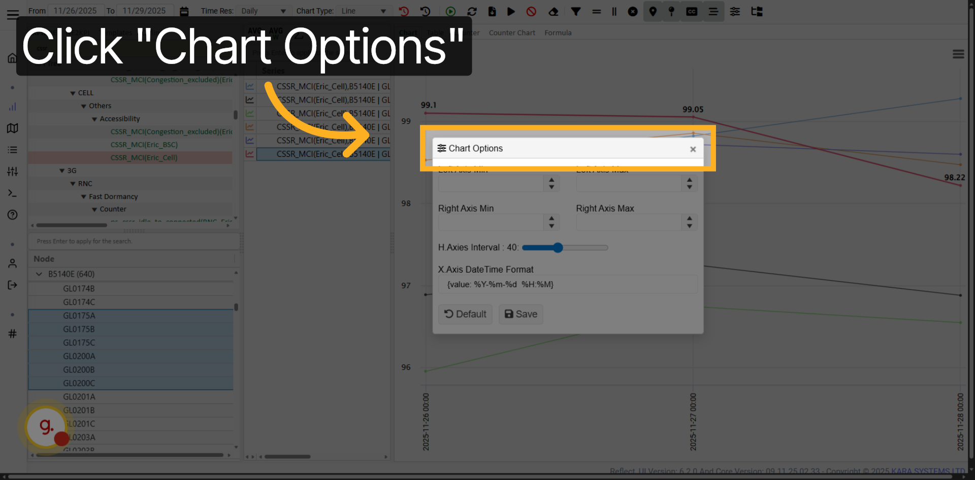
Click Chart Options to open the advanced chart configuration panel.
Access the axis configuration settings to fine-tune chart scaling and formatting.
Customer-specific settings will be explained in a separate tutorial.
Proceed to the customer tutorial to learn about customer-specific configurations.
Click Apply to confirm your selected date range and complete the workflow.
You have successfully learned how to use the KPI View tools to adjust time ranges, change chart types, apply filters, download data, manage chart settings, and customize KPI visualization. These tools help you analyze KPI data more effectively and prepare clearer trend-based reports.